A New Look
A New Look |
|

Two months ago, you may have noticed a change to our cover design. As we announced in the January issue, the new cover gives us more room to describe what's inside the magazine. In this issue, we're changing the inside also. We hope you like the new layout you'll find in this month's issue.
I'm excited by the new design, and I hope you are too. The first thing you'll notice in this month's issue is a change to the way we handle the lead image that appears at the beginning of each article. Instead of beginning the article with a small, rectangular image of something like a dinner table or sleeping cat, we are letting the lead image spill across the page a bit more. The result is a freer and bolder swath of color sweeping across the beginning of each article. The first reason for this change is that it looks pretty. But, in fact, this freer use of the image also offers some technical benefits that may not be apparent to the untrained eye. These benefits are related to the arrangement of elements on the page. The new approach should make it simpler and more efficient to lay out an article.
Many of the other changes are also difficult to detect but equally important to the grand design. You'll notice the headers and footers - the blurbs of text in the top and bottom margin that announce things like the page number and issue date - have also changed for better readability. Many of the fonts have changed also, especially in sidebars and other special elements. The new design will be easier to read because it provides a more flexible system for handling matters such as justification and the placement of figures.

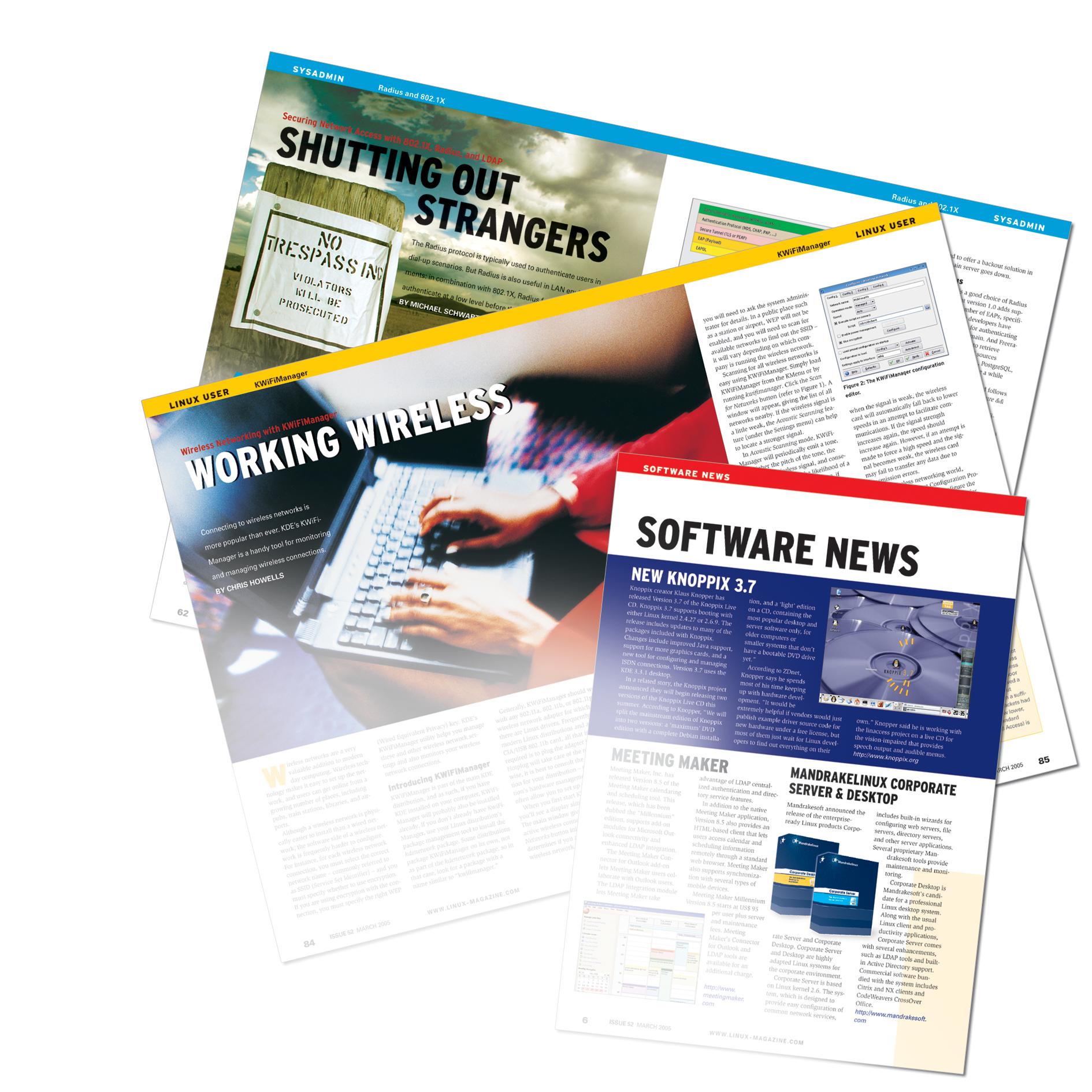
While we're on the subject of images, if you are ever looking for something to do (say you have already read all the articles and your plane won't land for another 20 minutes), browse through the pages and look for the subtle connection between the title and the lead image in a typical article. The title and the image always come as a matched set. The image usually isn't about Linux, but it usually has some kind of connection with the title. We start by thinking up a title and looking for an image to match, but if we can't find a good image, we sometimes choose an image and think of a title to make the image fit the article. Because the real description of the topic is covered in the subtitle (the red text above the title), the title itself can be free form and even a little poetic. The title refers to something in the article, and the image is a kind of visual pun that hints at some connection.
Some of my favorite moments are the long brainstorming sessions we always seem to have about which image to use with which title. If we were all in a situation comedy, instead of emailing each other across the ocean, I'm sure the task of choosing lead images would figure into every episode. You have probably heard us say we have an international readership, but you may not know we also have an international editorial staff, with team members in the UK, the USA, and continental Europe. This task of choosing images always seems to highlight national differences in what we think is tasteful and what we think is funny. Our email threads could be in a text book on International Relations.
Anyway, we want to know what you think about our new design. If you have an opinion, email your thoughts to us at letters@linux-magazine.com.