
By Kristian Kißling
In the early 90s, HTML was not expected to do anything apart from rendering text and providing links. Layout functionality arrived later due to industry lobbies. The aftermath is what we have today: incredibly long table columns and clumsy font definitions. The layout for 100 characters of text can take twice that amount of HTML code.
To solve the problem, the World Wide Web Consortium (W3C)[1] approved the first version of (Cascading Style Sheets) CSS in 1996. CSS provides a flexible means for defining style elements. You can use CSS to achieve more granular and efficient control over your web designs. CSS lets you define a layout for every single HTML element, even for a single letter. You can change the size of the element, create a frame, and add space. This article gives you a bird's eye view of the current version of CSS, Version 2.1; you will need some knowledge of HTML to follow this article.
To write CSS, all you really need is a standard text editor. The KDE editor, Kate, automatically checks your syntax. Although a syntax check may not be strictly necessary, it is a nice feature to have - considering the fact that CSS, in contrast to HTML, will not work if you get the syntax wrong. You do not need to be a programmer to work with CSS.
Suppose you have an HTML page, and you have defined a color for the link text in a <body> tag.
<body link="#000000" alink="#CCCCCC" vlink="#666666">
Because you can't change the color of a single link using HTML, all your links will be displayed in this color. CSS, however, allows you to manipulate individual links quite easily:
<a href="http://www.linuxmagazine.com"style="color: white; text-decoration: none;">
The style element contains the layout properties for the link. The link is now white (color: white;) and no longer underlined (text-decoration: none).
Let's look at another example. Imagine you have several pages of text full of quotes (blockquote), and you want to change the font to highlight the quotes. To do this, you would normally open all of your HTML pages and use search and replace to make the changes. Of course, this method is not very efficient. With CSS, you would just need to modify a single line in the central CSS file.
blockquote {font-family: Arial, Helvetica, Courier;}
All of the HTML files that use the central style sheet will now use one of the three specified fonts for quotes. CSS can save a lot of manual coding. At the same time, CSS gives you a tool for centrally defining and modifying the appearance of recurring elements. You can even create an alternative style sheet that optimizes your HTML for printing. If a user then wants to print a page, a style sheet is enabled that removes the menus and images from the text, scales up the font, or changes the font.
Csszengarden [2] gives you a good idea of what you can do with a run-of-the-mill HTML page. Visitors can design their own style sheets for a complete HTML document. The amazing results demonstrate the graphical capabilities of CSS. This said, you will need a fairly recent browser to leverage the power of CSS 2.1. A table at [3] tells which browsers support which CSS properties.
There are three approaches for adding style definitions to your own HTML. You already know one of them: you could add the definitions to the tags in the HTML source code.
$A href="www.linuxmagazine.com" style="color: #FFFFFF; text- decoration: none;"This is a link $/A
The style element introduces the CSS code that follows. You need to put the properties in quotes and separate them with semicolons. The second approach is to define the HTML page layout in a $style tag within the page header, as follows.
<head>
  <title>
    My webpage
  </title>
    <style type="text/css">
    h1 {color: red;}
  </style>
</head>
The third approach is to put the style sheets in a separate file. This gives you the advantage of integrating the style sheets using a single link in the HTML page header. In other words, all of your HTML pages take their layout information from a single file titled sheet1.css.
<head>
<link rel="stylesheet" type="text/css" href="sheet1. css" title="test" media="screen">
</head>
There is no need to open every single HTML file to modify the web page appearance; instead you just modify the CSS file that the pages reference.
But what happens when you apply CSS to a single HTML element, that is, to a piece of text, an image, or even a single character? CSS creates a box (Figure 1) comprising the content, the internal padding, the border, and the external margin. The border itself has an effect on the total width. The margin is the distance between the border and the neighboring box. You can modify the padding, margin, and border for almost any element.
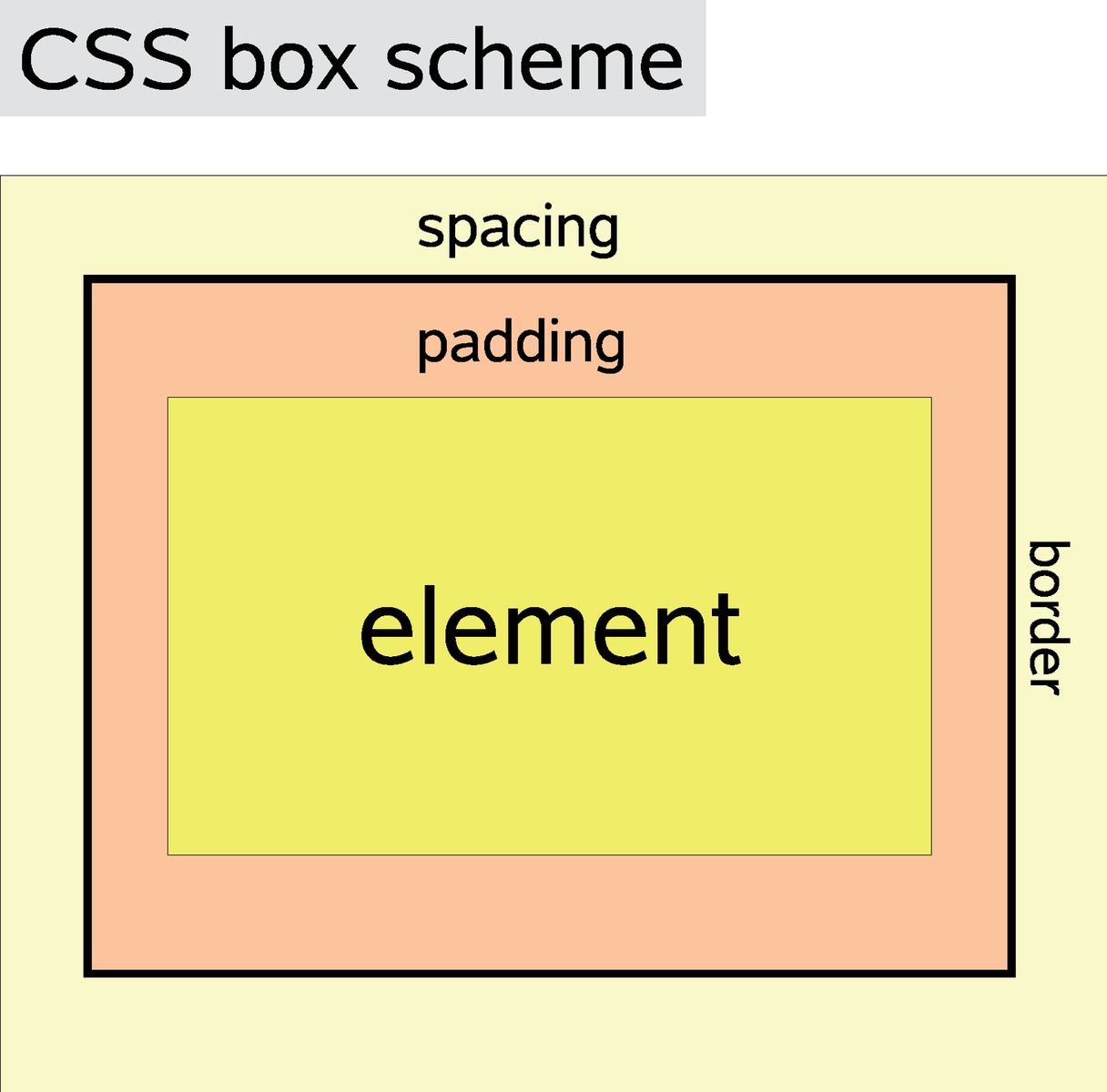
Calculating the total width of a box involves some simple math. Given an element with a width of 12 pixels, 3 pixels of padding, 1 pixel of border, and 4 pixels of margin, the total width of the element would be 28 pixels: 12 pixels (content) + 6 pixels (left + right padding) + 2 pixels (left + right border) + 8 pixels (left + right margin) gives you 28 pixels in total. With CSS, and in contrast to HTML, you define borders, padding and margins individually for each page. To add a frame above an element, you could enter border-top: 1px solid black;. padding-right: 10px; would modify the padding for the element on the right. CSS also distinguishes between block and inline elements. Block elements create paragraphs, inline elements can be part of a block element but do not create a paragraph. The $b tag is a typical inline element, and $hr is a typical block element. The display: block; tag can change an inline element into a block element; and display: inline; does exactly the opposite.
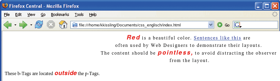
As web pages basically transport text-formatted information, let's focus on text layout with CSS. I will leave it up to you whether you store your CSS instructions in a separate file or use one of the other approaches we looked at earlier in this article. I chose an external file for the following example. First, create an HTML file with typical tags such as <html>, <head>, and <body>, and store this as index.html (Figure 2). Then type the short text from Listing 1 as the <body> of the file, including all the tags.
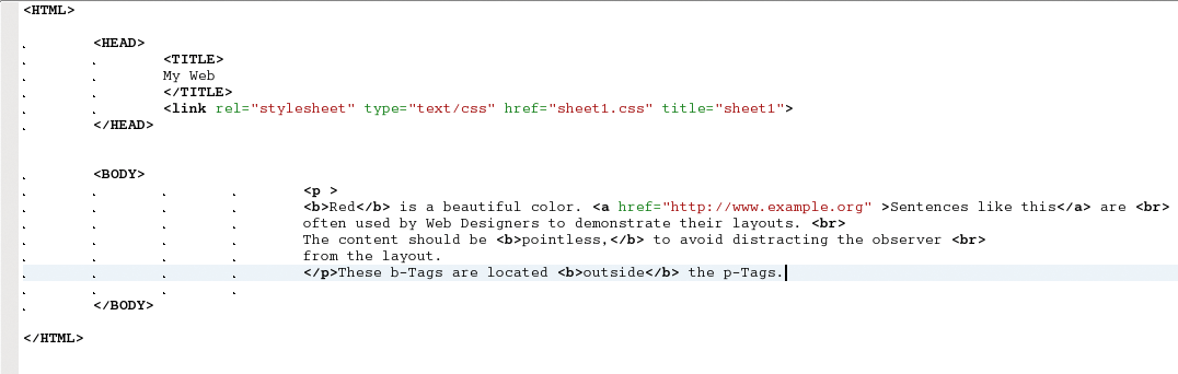
| Listing 1: Sample HTML |
01 <p> 02 <b>Red</b> is a beautiful color. <a href="http://ww.example.org">Sentences like this</a> are 03 <br> often used by Web Designers to demonstrate their layouts.<br> The content should be pointless 04 <b>pointless</b>, to avoid distracting the observer <br> from the layout. 05 </p> 06 These b-Tags are <b>outside</b> the p-Tags. |
Open a new file in Kate and store the file as sheet1.css in the same directory. You can integrate the style sheet using a link in the index.html header:
<head>
<link rel="stylesheet" type="text/css" href="sheet1.css" title="sheet1">
</head>
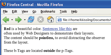
Without layout information, the browser would display the text for index.html in large black letters, with the text excerpts tagged with < b > bold, and links underlined and in blue type (Figure 3). To modify the font type, color, and size, you can now edit the empty sheet1.css file:
b {
  font-family: Arial, Helvetica,Courier;
  font-size: 130%;
  color: red;
  font-weight: bold;
  font-style: italic;
  }
p {
  font-size: 16px;
  }
Now, when you open the index.html file in your browser, note the difference the layout instructions from the style sheet have made (Figure 4). You can use font-family to specify which font your browser will choose to display the text. Windows browsers will probably go for Arial, whereas Mac browsers will use Helvetica, and Linux browsers will use Courier. If the viewer does not have any of these fonts installed, the font will be the browser default. The font-size property allows you to set the font size. The browser will typically assume that a font-size of 100% of the preset font. However, the HTML code has a <p> tag with a font size of 16 pixels surrounding the < b > tag. The font size is based on the size of the parent element. So if the 16 pixels of the <p> tag are 100% for the < b > tag, a font-size of 130% will be 20.8 pixels.
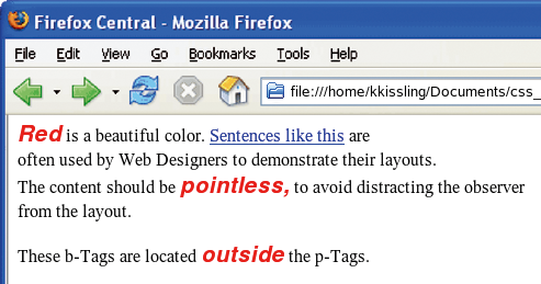
Colors are changed just like in HTML. You can either specify a color name or a hexadecimal value such as #FFFFFF for the color property. The font-weight property helps you enable bold type. You can select a value from bolder, lighter, or normal. The font-style options are italic, normal, or oblique. Now add four additional lines inside the curly braces for the p tag:
letter-spacing: 2px;
line-height: 25px;
text-align: center;
vertical-align: top;
The text inside the <p> tag changes noticeably (Figure 5). letter-spacing changes the space between letters, and the line-height changes the space between lines. The next two properties align the text, with text-align selecting the horizontal text position, which can be center, right, left, or justify. vertical-align takes care of the vertical position. In our example, the text is pinned to the top of the surrounding block; the other positions are middle and bottom.
The neatest thing about CSS is that you can dress up each element individually. For example, you could add border: 1px solid #000000; to the b element in your style sheet. Anything you now tag with < b > will now be surrounded by a black frame with a single-pixel continuous line border. You can modify the frame of course, changing the line type to dashed, or dotted. If you only need a frame for a single page, you can specify border-left: 1px dashed red; or border-bottom: 1px dotted green;.
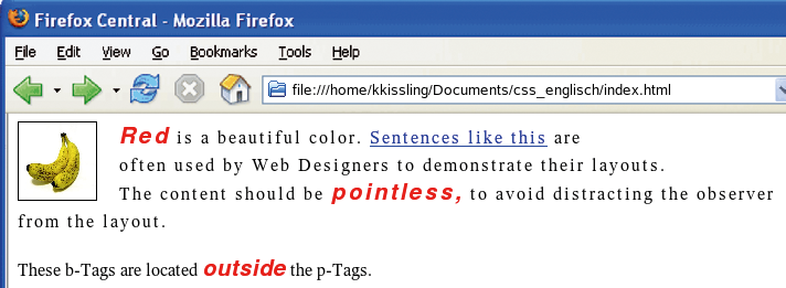
The float property helps you position images. Create an image titled testfig.jpg and store it in the same directory as your index.html file. You can then add the image to the HTML file using the <p> tag:
<img src="testfig.jpg">
To use the effect, first left justify the text. Then go to the style sheet and delete the text-align: center; property for the element p not forgetting to add a definition to handle images:
img {
    width:50px;
    height:50px;
    float: left;
    margin-right: 20px;
    margin-bottom:0px;
    }
float: left; positions the image on the left. The width and height values scale the image to the required size, and the margin-right: 20px; entry adds a margin between the right edge of the image and the text (Figure 6).
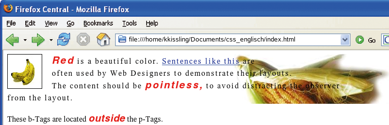
Attractive layouts often rely on background images. Create an image file called bgimage.jpg in the main folder and modify the properties of the p element in the style sheet file.
background-image: url(bgimage.jpg); background-position: center; background-position: top;
background-repeat: no-repeat; background-attachment: fixed;
A background image now appears behind the text (Figure 7). Due to the background-repeat: no-repeat; parameter, the image is only shown once. The background-position: center; and background-position: top; properties center the graphic and pin it to the top edge of the surrounding element at the same time to keep it visible. The background-attachment: fixed; entry means that the image will stick to the spot no matter what. CSS allows you to add background images to a variety of elements, including links.
You can change the background color for the link, remove the link decorations, or assign a frame to a link just by modifying the central style sheet:
a:link { color: white; background-color: #CCCCCC; text-decoration:none; }

a:hover { color: white; background-color: red; text-decoration:none; }

a:active { color: orange; text-decoration:none; }

a:visited { color: grey; background-color: red; text-decoration:none; }
Unused links now appear in white and with a gray background. If you hover the mouse over a link, the background turns red, and when you click on the link, text turns orange. Links you have visited change color to gray with a white background. But what happens if you still need a few blue and black links? And you will definitely not want all of your images pinned to the left-hand side of the page! In this case, you can leverage the power of inheritance.
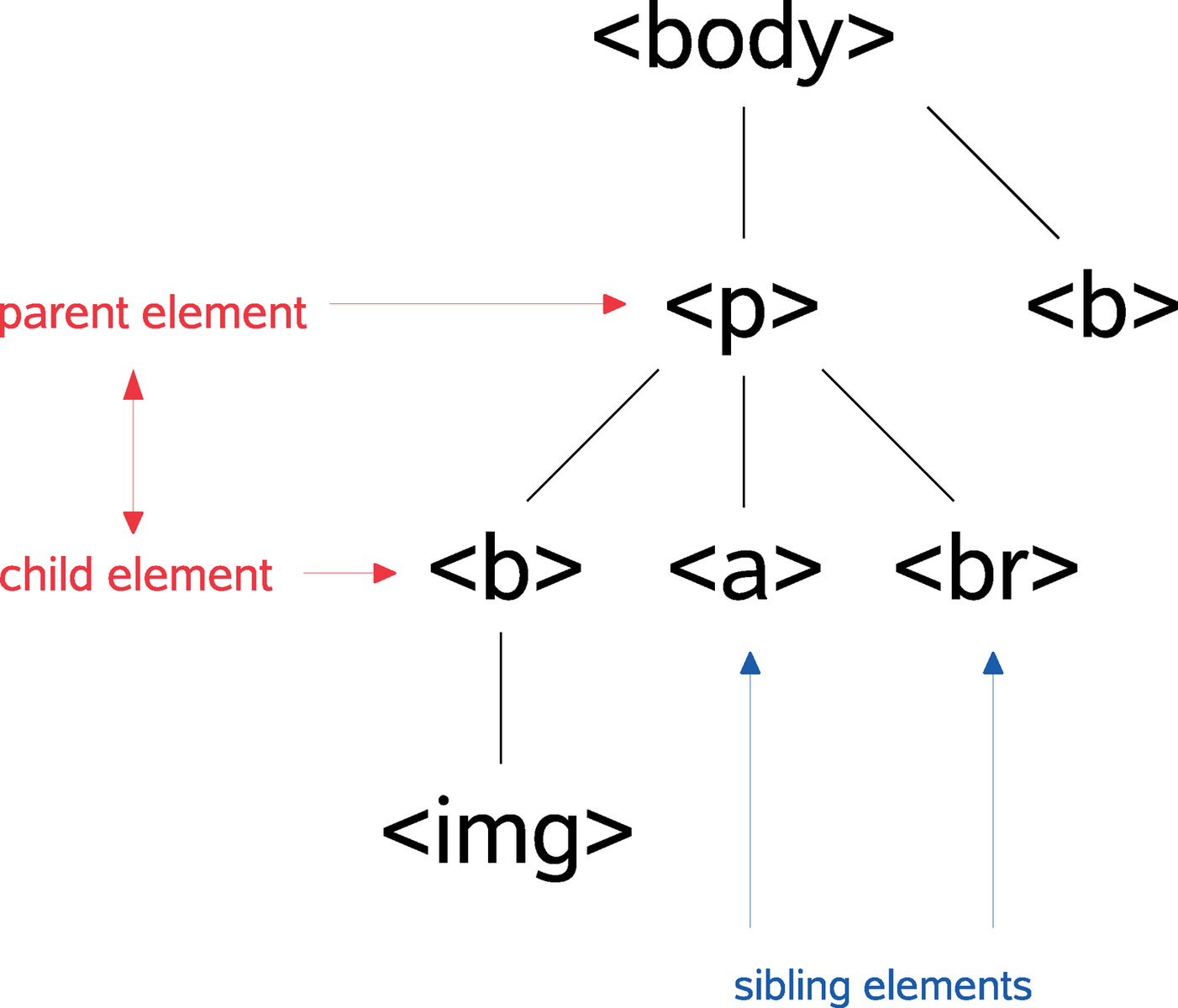
A parent element precedes the child element and surrounds it. The < b > tag in the index.html file is the child element of <p> which in turn is the child element of <body>. The <body> tag is the ancestor of the <img> element, or you could say that the <img> element is descended from - but not the child element of - the <body> element. Sibling elements are at the same level, such as the <p> element and the third < b > element in the image (Figure 8).
The interesting thing about inheritance is that child elements typically inherit the properties of their parents. For example, an image does not typically need more space than the table or cell in which it is located; the child element < b > inherits the font size from <p>. Inheritance can give you a big advantage, as it allows you to pass properties across so-called sections. There are various approaches:
p b { color:green; }
p > b { color:blue; }
p + b { color:orange; }
* { color:violet; }
You can add these four sections alternately to the style sheet, thus triggering different effects. The context selector in the first line displays any < b > tags inside the <p> tags in green. The child selector in the second line colors the < b > element blue if it is a direct child, rather than just descended from <p>. The + sign in the third line applies the formating to elements following <p>, and descending from the same parent element. In our example, the < b > element in Line 2 fulfills these conditions. It follows <p> and has the same parent element, the <body> tag, so the text inside the < b > tags is displayed in orange. The fourth line colors any elements that do not have specific color assignments.
Class selectors, or just classes for short, give you the ability to address each style sheet individually. To do so, add the following line to your style sheet:
*.word {color: blue;}
Then open the index.html file and change the text as follows:
... as <b class="word">non-descript</b> as possible ...
First, create a {color: blue;} value, which will be assigned to all tags (*) belonging to the .wort class. The second step is to state which tags belong to the .word class, again in the index.html file. Any tags that you specify as class="worr" will automatically assume the values of the .word class, that is, they will turn blue.
You can also design your own tags with CSS. To do so, first define your own tag in the style sheet, for example redletter {color: red;}. Adding <redletter> any text </redletter> to your HTML file will color the text inside the tags red.
If you decide to construct a complete site using style sheets, it definitely makes sense to build containers. To build containers, split your web pages into fixed sectors using the position property, <div> tags, and classes. To do so, add the lines from Listing 2 to your style sheet. Then put <div> tags around the content of the <body> tag in the index.html file:
<body>
<div class="container_central">
...
</div>
</body>
The page content is now inside the <div> container. This means that you can define as many containers as you like and save frames and tables.
| Listing 2: Building Containers |
01 div.container_central {
02   position: fixed;
03   top: 0%; left: 30%;
04   background: #CCCCCC;
05   width: 400px;
06   height: 600px;
07   color: red;
08   border: 1px solid black;
09   padding: 20px;
10   overflow: scroll;
11 }
|
As the position property contains the value of fixed, the container is pinned to a fixed position, 0% from the top and 30% from the left edge of the screen. width and height allow you to define the area; you can set the font color to red, and apply 20 pixels of padding to make sure you have enough space between the content and the border.
| INFO |
|
[1] The W3C CSS pages: http://www.w3.org/Style/CSS/
[2] CSS to the max: http://www.csszengarden.com/ [3] Check browser compatibility: http://www.css4you.de/browsercomp.html |