By Gaurav Nawani
Well-styled text adds some extra flash and brings out the character of any design. GIMP offers many creative possibilities to style and manipulate text. In this article, I examine a few of the options for creating attractive text effects.
The examples here use the GIMP 2.4 pre-release, but by the time this issue reaches print, GIMP 2.4 will be out and ported to all Linux distributions. Some of the features discussed here are available only in GIMP 2.4. Also, the menu structure of GIMP 2.4 is very different from GIMP 2.2x, so you'll have an easier time following the discussion if you're using the latest version.
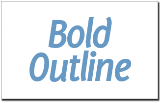
One popular option for spicing up text is to create a small outlined border around the letters. To start, create a new image of any suitable size (Figure 1) and press the T key to activate the Text tool.
On the canvas where you want to place your text, left-click and start typing in the Gimp Text Editor dialog box. To change the font and color of the text, go to the Tool Options dialog box. GIMP automatically creates a text layer above the default (background) layer.
In the Layers dialog box (Figure 2A), create a new layer below the text layer you just created and rename it text_outline. First, select the text layer in the Layers dialog box to make it active. Then, go to Layer | Transparency | Alpha to selection. This creates a selection from the text.
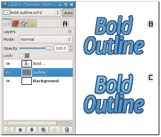
Now select the text_outline layer in the Layers dialog box and go to Select | Grow to increase the size of the selection by two to four pixels. Pressing Shift+B activates the Bucket Fill tool, and you can fill the selection with some color to create an outline for the text (Figure 2B).
In GIMP, it is not possible to get fine anti-aliased edges when the selection is manipulated a few times over. A visible deformation appears in the shape of the selection that is created from the text; this phenomenon is evident in the choppy effect at the top and bottom of the letter O (see Figure 2C).
In certain cases, it might not be possible to get a well-maintained shape with changes of up to even a few pixels, and beyond that, the selection will lose the outline shape very fast. Therefore, it is important to use selection manipulators that grow or shrink up to a few pixels only.
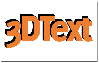
Another common text effect is to make the letters appear in 3D. To get started, create a new image, add some text, and color it (anything but black).
To create a 3D appearance, you'll need to add depth to the text, or at least create the illusion of depth. While the text layer is selected, press Shift+Ctrl+D to duplicate the text layer so that you can make your changes to this copy and preserve the original.
Next, color this duplicated layer black and then move it below the original colored text layer (use the Layers dialog box). Now come back to the canvas and press M (for the Move tool) and use keyboard arrow keys to move the duplicate layer up by five pixels and left by five pixels. (When the Move tool is active, you can use the arrow keys to move the object/selection in units of single pixels.) The result will be something like the image shown in Figure 3B.
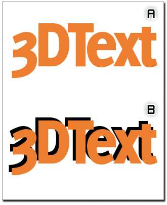
If you look closely at Figure 3B, you will notice that the text does not look solid; it just looks shadowed. The next step is to fill up the text shape to give it a solid 3D feel.
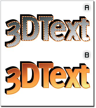
First, duplicate the black text layer then move it one pixel down and one pixel right. If you do this three more times, each time taking the newest duplicated layer, you will observe that your 3D text begins to really look 3D (see Figure 4).
To make the 3D text even more convincing, you can add the effect of light falling on the 3D shape. Because the dark part in the text is toward the top left, the light should be coming from the bottom right direction.
First, create a selection from the colored text layer and reduce the selection size by two pixels.
Then, create another layer on top of the colored text layer and rename it light_source.
With the gradient tool, draw a black and white gradient diagonally from bottom right to top left (see Figure 5A). Now change the layer mode to Grain Merge. The result is shown in Figure 5B.
The text used with computer games often has a sporty or cartoonish look designed to complement the look and feel of the game. To use this technique effectively, you will need fonts with a rounded appearance. MgOpen Moderna, for instance, is a rounded font that comes pre-installed with Ubuntu.
To begin, create a new image and add some text. Next, color the text appropriately and create a selection from the text layer; shrink the selection by two pixels, create another layer and rename it bumptop, then select the Gradient Fill tool by pressing the L key; change the shape option to Shaped (spherical) and keep Adaptive supersampling on (see Figure 6B).
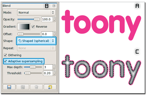
Now, draw the gradient by left-clicking and dragging in any direction; GIMP will automatically fill the gradient in the selection (see Figure 6C).
Pressing Shift+Ctrl+A removes the selection. Now create another layer below the bumptop layer and fill it with black. Next, select the bumptop layer in the layers dialog box, go to Layers | Merge Down to merge the bumptop layer with the black layer you just created, and then rename the composed layer bumpmap.
Apply a Gaussian blur (Filters | Blur | Gaussian Blur) of 2 and reapply it once.
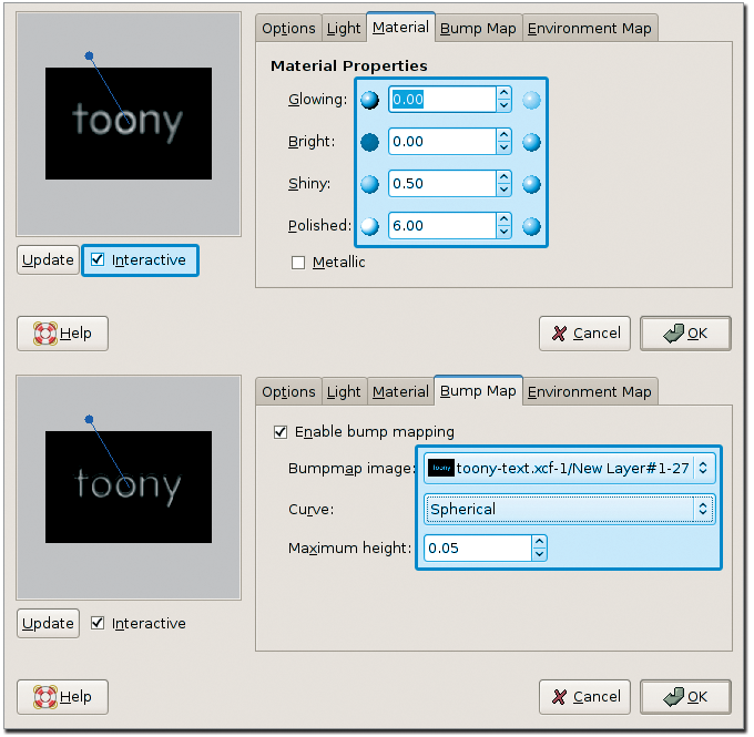
Now go to Filters | Light & Shadow | Lighting Effects. The Lighting Effects dialog box will pop up. On the left of the dialog, you will see a checkbox labeled Interactive. If it isn't already enabled, then enable it.
Now switch to the tab named Light and change the light type to Directional. Next, switch to the Material tab and copy the values from the image.
Now switch to the Bump Map tab and check the box labeled Enable bump mapping, then pick the bumpmap layer as the source Bumpmap image from the drop-down list (see Figure 7) before pressing OK. Now change the layer mode of the bumpmap layer to Screen in the Layers dialog to see the toony text effect shown in Figure 8A.
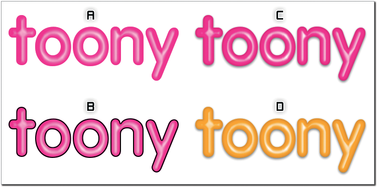
If you want the text to be nicely rounded and smooth, select the Text layer from the Layers dialog box and go to Layer | Transparency | Alpha to selection. Then, create a new layer (Layer | New Layer), fill the selection with black color, and shrink the selection (Select | Shrink) by 2.
Immediately press Ctrl+X to delete the selection, and you will get a black border inside the text (see Figure 8B).Change the layer mode of this layer to grain merge and the opacity to 30. This will bring out the roundness in the shape of the toon text, as you can see in Figure 8C. Figure 8D is a variant of the same text in another appealing color.
If you need more shine, play around with levels on the bumpmap layer.
TIP: The Lighting filter is an excellent way to create text effects. For example, if you were to increase the maximum height in the Bump Map tab, the result would be more akin to metallic-textured text. Try a variant of this text if you're looking for a metal text effect.
To create any type of curved text, you will need GIMP 2.3x (unstable) or 2.4x.
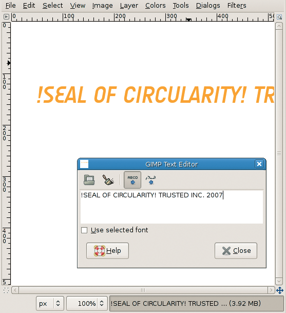
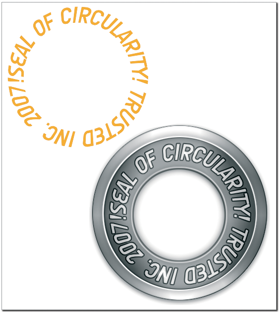
To demonstrate GIMP's curved text feature, I'll show you how to create a circular logo. With the text tool (T), enter the text for the logo.
Do not worry if the text goes out of the bounds of the canvas (see Figure 9). Because it is a text layer, all information will be retained if you save the file in GIMP's native XCF format.
To draw a circular selection on the canvas, select the Ellipse selection tool by pressing the E key. To get a perfect circle, hold down the Shift key while creating a selection (Figure 10A). This method works even while modifying the selection, which is a new feature in GIMP 2.4.
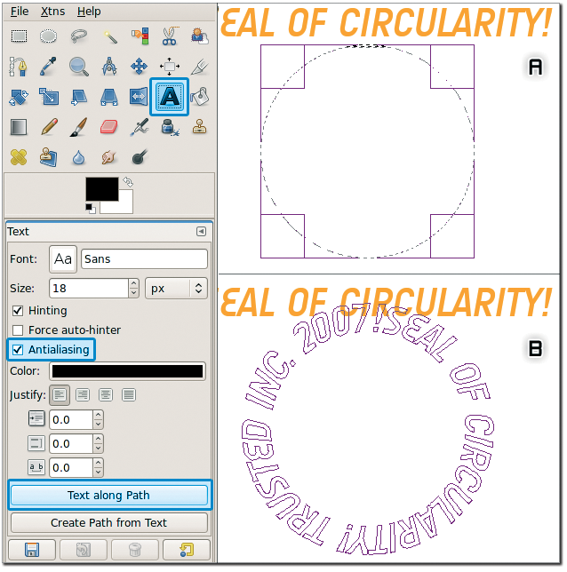
If you go to the menu (Select | to path), GIMP will create a path from the selection, and you can check it in the Paths dialog box.
Next, press Shift+Ctrl+A to de-select the selection.
To select the text tool, press the T key and left-click once on the text on the canvas.
In the Tool Options dialog, you will see a button at the bottom labeled Text along Path. If you click it, the text will align along the circle path you previously created (see Figure 10B).
The shape of the curved text will be based on the currently selected path in the Paths dialog box, so if you have more than one path layer, make sure to select the right one before proceeding.
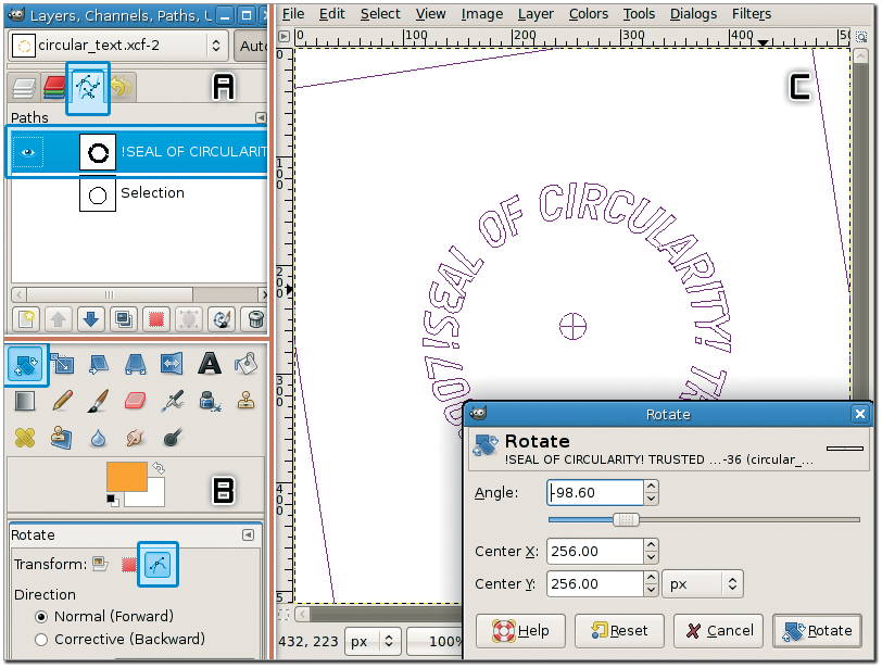
The circular path shown in Figure 10B is not rotated correctly. To get the circular logo to look right, I want the text !Seal of circularity! at the top, so I need to rotate the path. GIMP keeps the Normal and Path layers separate, so to rotate a path, you have to specifically tell GIMP you are transforming the Path layer.
Make sure you have selected the !Seal of circularity! path. (If you create a path from text, GIMP automatically gives the resultant path layer a name that is related to the text.)
In the Paths dialog, press Shift+R to enable the rotate tool, then choose a path icon in the Tool Options dialog; left-click on the canvas, and a dialog will pop up in which you can fill in the rotation amount (Figure 11).
In the Paths dialog, right-click on the circular logo path and select path to selection to create a selection.
To create a transparent layer, go back to the Layers dialog and fill the selection with some color. I couldn't keep from playing with that plain text logo, so I went ahead and created a complete logo design for fun (see Figure 12).
The text effects in GIMP will do a lot more than described here, but I hope this tutorial will give you some ideas about how to create your own custom text styles.
| INFO |
|
[1] Delicious font: http://www.josbuivenga.demon.nl/
[2] Audimat font: http://www.smeltery.net/ |