
By Juliet Kemp
If you ever work with HTML, you are probably familiar with the stylesheet language known as Cascading Style Sheets (CSS). The purpose of CSS is to let you separate the presentation of a web page from the content. The content is described through a markup language such as HTML or XHTML. The presentation is managed through CSS.
Separating content from presentation makes the HTML cleaner and easier to read, and it also means that you can change the presentation across a whole site much more easily. Do you want to change all your h1 headers from centered blue 20-pt to left-aligned red 24-pt? With CSS, you can do that by changing a single file. CSS also improves accessibility; users with special needs can easily create custom style rules for easier access.
Although it is possible to put CSS rules in an HTML file, it is better to create a separate CSS file, because it gives you a central point for managing the style. In a typical CSS scenario, the HTML header will look like that shown in Listing 1, and the CSS file will look like Listing 2.
Note that you can apply styles to all instances of a particular HTML tag (as with <h1>) or only to certain instances by labeling them with a class type.
| Listing 1: sample.html |
01 <!DOCTYPE html PUBLIC "-//W3C//DTD XHTML 1.0 Transitional//EN" "http://www.w3.or 02 g/TR/xhtml1/DTD/xhtml1-transitional.dtd"> 03 <html> 04 <head> 05 <title>Page Title</title> 06 <link rel="stylesheet" type="text/css" href="site.css" /> 07 </head> 08 09 <body> 10 <h1>Page Header</h1> 11 <p class="firstpara">This is the first paragraph of the page.</p> 12 13 <p>Some more text here</p> 14 </body> 15 </html> |
| Listing 2: site.css |
01 h1 {
02         color: blue;
03         font-size: large;
04         text-align: center;
05 }
06
07 p.firstpara {
08         text-align: center;
09 }
|
CSS does far more than allow you to change the color, size, or background. Artful use of CSS lets you add interesting new elements to your site, and CSS can even help you replace difficult-to-use tables and Javascript. This article goes beyond the headings and fonts to show how you can easily add new features to your website with CSS. Read on for a look at how you can employ the expressive power of CSS in your own environment. This article assumes you have some basic familiarity with CSS.
For additional information, try the W3C Cascading Stylesheets homepage [1]. You'll also find several CSS tutorials on the web [2].
A very common page layout is one that has multiple columns on a page. Previously, you might have handled multiple columns with the use of a table, but the table option is frowned upon from an accessibility point of view, and a table can be difficult to maintain. It's easy to get confused about what part of the page is where, and to forget to close off your tables, cells, and rows properly, which might confuse some browsers.
CSS to the rescue: You can use the float property to make your layout multi-columned but clear and easy to use.
Listing 3 shows the HTML for a two-column layout with a full-page-width header and footer; Listing 4 shows the CSS. Listing 3 uses id to identify the containers rather than name or class, although these options work in similar ways.
| Listing 3: columns.html |
01 <div id="container"> 02 <div id="header"> 03 <h1>Header of page</h1> 04 </div> 05 <div id="columnone"> 06 <h2>Column One text</h2> 07 <p>Put your text here.</p> 08 </div> 09 <div id="columntwo"> 10 <h2>Column Two text</h2> 11 <p>Put your text here.</p> 12 </div> 13 <div id="footer"> 14 <p>Footer text</p> 15 </div> 16 </div> |
| Listing 4: columns.css |
01 #container {
02         width: 100%;
03         background: #9cf;
04 }
05 #header {
06         width: 100%;
07         padding: 1%;
08     text-align: center;
09         background: #999;
10 }
11 #columnone {
12         width: 45%;
13         float: left;
14         padding: 1%;
15 }
16 #columntwo {
17         width: 45%;
18         float: right;
19         padding: 1%;
20 }
21 #footer {
22         clear: both;
23         text-align: center;
24         font-style: italic;
25         background: #999;
26 }
|
The class is best used when you have more than one example of the type on a page. With this column layout, you should have only one columnone per page. The id is better for identifying a particular type of an element, whereas name is good for identifying a particular instance of an element - for example, a specific menu item on a page. In this case, I want to identify a generic type of element (e.g., a columnone sort of div), so I use id.
The width of column 1, plus the width of column 2, plus twice the padding of column 1 (once for the left side, once for the right side), plus twice the padding of column 2 need to add up to 100% or less for the float to work correctly.
The footer uses the clear property to make sure it stays below both the previous floats. This means that the container element will extend around all of the other elements.
To explain that last statement a bit further: Floating elements don't "count" in the page layout. When the browser is laying out the page, floated elements are put "on top" of other elements, rather than placed in the regular flow of the page. If you don't have an element after your floats that uses clear, then they won't be within any container element - they look like they're floated on top of the container element, instead. This almost certainly isn't what you need, so here I use a footer. (It doesn't have to have any content!)
If you want to add a third column, you can add another float: left <div>, or you can float one column left and another one right, if you prefer, with a static central column. Again, make sure the width of all three columns plus their padding on each side adds up to less than 100% of the page width; otherwise, one of the columns will be forced below the others.
The use of percentages means that as people shrink or enlarge their browser windows, the columns and other elements will shrink and grow accordingly. This approach is more flexible than hard-coding the width of the elements. However, you can use min-width or max-width if you don't want them to be shrunk below a particular size. If you put min-width on the container element, scrollbars will appear if the user tries to shrink the browser window below this size. This technique can be useful if you want a fairly narrow column on one side and you don't want it to shrink beyond the width of, say, a menu item title.
The other attributes - background and font-style, for example - set other properties of the containers.
See Figure 1 for a look at this basic layout.

A horizontal nav bar along the top of your site is often untidy and hard to manage. Instead, you can achieve the same effect by writing the navigation as a list and then using CSS to style the list.
Listings 5 and 6 show the code.
| Listing 5: navigation.html |
01 <div id="nav"> 02 <ul> 03 <li><a href="/">Home</a></li> 04 <li><a href="/contact.html">Contact us</a></li> 05 <li><a href="/location.html">Find us</a></li> 06 <li><a href="/products/">Product list</a></li> 07 </ul> 08 </div> |
| Listing 6: navigation.css |
01 #nav {
02         text-align: center;
03 }
04 #nav a {
05         padding-right: 10px;
06         text-decoration: none;
07         color: #036;
08 }
09 #nav ul li {
10         list-style-type: none;
11         display: inline;
12 }
|
The screenshot shown in Figure 2 shows what this menu looks like when added to the two-column layout described previously.

The text-align: center; attribute centers everything within this <div>. Below that, the padding-right attribute gives some space between the menu items - you can adjust this to your preference.
The text-decoration: none removes the underlining that links have by default - this is tidier for a menu like this. I've also changed the text color.
The list-style-type: none statement means that the list won't have any bullets by the items - again, a neater style for a menu.
Alternatively, a variety of list-style-type values are available if you do want a bullet or number by each item. The display: inline means that, instead of the standard list structure in which each item displays on a new line, the list items will display on the same line, one after the other. With display: none, you could even choose not to display the list at all. The normal behavior for lists is display: block - this puts each element on a new line. Other elements can have a display value as well.
By tagging the list (e.g., <ul class="nav">) and editing the CSS appropriately, you could achieve a similar effect, but putting it inside a div tag is more flexible.
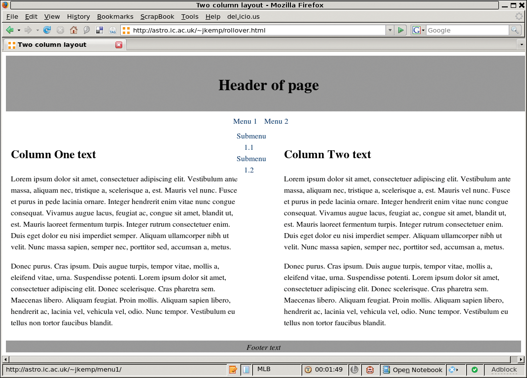
So you have your nav bar, but now you want to make submenus pop up on rollover. Do you think you'll need Javascript to do this?
Think again - you can make it happen with CSS. I should point out that IE6 doesn't work with this technique. To get around this problem, make sure the parent link is clickable and goes to a page that indexes the submenu, which is good practice anyway for accessibility reasons. Alternatively, you can set up Javascript that runs only if it detects an IE6 browser.
In Listing 7, the navigation is again set up as a list, but this time with submenus as sublists (Figure 3). This configuration is very basic, aesthetically speaking, but you can do much more to make it look more attractive.
| Listing 7: rollover.html |
01 <div id="nav"> 02 <ul> 03 <li><a href="menu1/">Menu 1</a> 04 <ul> 05 <li><a href="menu1/sub1.html">Submenu 1.1</a></li> 06 <li><a href="menu1/sub2.html">Submenu 1.2</a></li> 07 </ul> 08 </li> 09 <li><a href="menu2/">Menu 2</a> 10 <ul> 11 <li><a href="menu2/sub1.html">Submenu 2.1</a></li> 12 <li><a href="menu2/sub2.html">Submenu 2.2</a></li> 13 </ul> 14 </li> 15 </ul> 16 </div> |
Listing 8 shows the CSS. The basic list setup (which will apply to both the outer and the inner lists) has no margin but a little padding and a contrasting background. The sublists do not display by default; otherwise, they would just be there all the time rather than appearing only on mouseover.
| Listing 8: rollover.css |
01 #nav ul {
02         padding: 1ex;
03         margin: 0;
04         background: #fff;
05 }
06
07 #nav ul ul {
08         display: none;
09 }
10
11 #nav ul li {
12         list-style-type: none;
13         position: relative;
14         margin: 0;
15 }
16
17 #nav ul li:hover > ul {
18         display: block;
19         position: absolute;
20         top: 100%;
21         left: 0%;
22         background-image: url(/images/fix_ie_hover.gif); */ IE7 bugfix */
23 }
|
Locating the list items by relative position means that they are positioned within the general flow of the page (in other words, they are positioned after the elements before them, and before the elements after them!), although values such as top and right are honored. As in an earlier example, you don't want bullets; hence, you set list-style-type.
The magic happens in the final section. When you rollover a list item that has a list child element, it will now display. It displays as a block list, with absolute position (meaning it doesn't get pushed out of the way by any other elements) underneath the parent element (set by top: 100%, meaning the parent element is on top, which is slightly counterintuitive). The left: 0% value means that the sublist will appear exactly beneath the relevant menu item, rather than being offset. Without this value, the sublist will appear way over on the left-hand side of the page, which is its default.
Also, you could choose to have the sublist appear to the left, up, or down. For example, if you want to have a side menu, you would probably want the submenus to appear to the left. The best way to learn the various options is to play around with the settings.
The final background image element is an IE7 bug fix - without this, in some circumstances your rollover menus wouldn't be "sticky" in IE7. That is, instead of staying put for long enough for you to click on whichever submenu item you want, the submenu would vanish immediately when you take your mouse off the main parent list item. The background image fixes this - you should either use a transparent image, or a file with no content because it is the image call itself that resolves the bug. Of course, you can make this design more attractive by defining borders, custom bullets, different colored backgrounds, and anything else your heart desires.
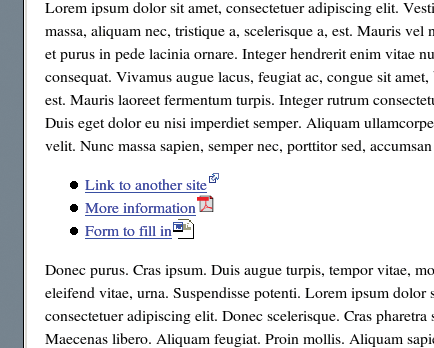
At times, you might want some means for marking external links on your site. Some users also might want to identify links to non-HTML files (Word documents or PDF files).
First, you need to set up a small image file with an appropriate icon - as shown in Figure 4. Adobe and Microsoft make appropriate icons for PDF and .doc files available on their websites; you'll have to find your "external link" icon from somewhere else. Then, you can set up the CSS to pick up on these sorts of links.
Listing 9 shows the HTML for this, and Listing 10 shows the CSS.
| Listing 9: links.html |
01 <ul> 02 <li><a href="http://www.anothersite.com">Link to another site</a></li> 03 <li><a href="documents/readme.pdf">More information</a></li> 04 <li><a href="documents/form.doc">Form to fill in</a></li> 05 </ul> |
| Listing 10: links.css |
01 a[href^="http:"] {
02     background: url(images/externallink.gif) no-repeat right top;
03     padding-right: 15px;
04 }
05
06 a[href^="http://www.example.com"] {
07     background-image: none;
08     padding-right: 0;
09 }
10
11 a[href$=".pdf"] {
12     background: url(images/pdflink.gif) no-repeat right top;
13     padding-right: 18px;
14 }
15
16 a[href$=".doc"] {
17     background: url(images/wordlink.gif) no-repeat right top;
18     padding-right: 25px;
19 }
|
The first section in the CSS uses a regular expression to set up the external link image as a background image for all links that begin with http. It's set to sit at the top right of the link and not to repeat. The padding ensures the image doesn't crowd into the right-hand side of the link itself. If you need to vary this padding according to the size of the icon, you could use slightly different settings for each icon, as I've done here.
The first section should automatically exclude any internal links because it's good practice to refer to internal links without the http in front of them. However, for cases in which the full form has been used, the second section cancels out the first for links within your site (obviously, you need to replace www.example.com with your own URL).
The last two sections do the same as the first, but they only apply to links ending with .pdf or .doc. Because these sections occur later on in the CSS, they'll override the external link icon. If you would prefer to display the external link icon, rather than a file-type icon, for a document on an external site, rearrange the order, but be aware that the first and second sections must be in order or the second section won't override the first.
The use of CSS instead of table layouts or Javascript (or, worse, Flash) makes your website much more accessible, as well as making it easier, tidier, and more maintainable. But bear in mind that you might face problems with some browsers (notably IE6) that don't implement the standards properly.
Make sure you check everything thoroughly on multiple browsers (including lynx, w3m, or another text-only browser) to ensure that your design is still usable if some of the snazzier options don't work properly.
For more examples of just what you can do with CSS, visit the CSS Zen Garden [3], an eye-opening site showing the power of CSS.
| INFO |
|
[1] Cascading Style Sheets homepage: http://www.w3.org/Style/CSS/
[2] Guide to Cascading Style Sheets: http://htmlhelp.com/reference/css/ [3] CSS Zen Garden: http://www.csszengarden.com/ |
| THE AUTHOR |
|
Juliet Kemp, who has been playing around with Linux ever since she found out that it was more fun than Finals revision, has been a sys admin for around five years. She is probably slightly obsessive about accessibility and tidy HTML. |