
By Michael Schilli
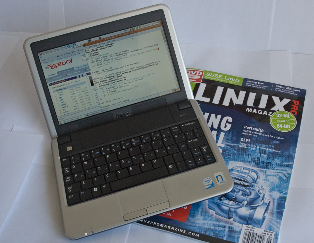
Very few people are seen with Windows laptops at open source conferences nowadays, unless, that is, they really want to be the center of attraction as stone age cave dwellers. For a while, I had been looking around to replace my old laptop when an offering by Dell caught my eye: a cute Mini 9 Ubuntu netbook at an unbeatable price of US$ 230 (Figure 1). So I finally made the move. Leif, a guy from work, even gave the cute gadget a funny nickname, "Mini-Me," after the tiny clone of Dr. Evil in the second Austin Powers movie.
My first impression was exhilarating; aside from some weird issues with ssh and the wireless driver, which I could resolve online, it actually worked! I then went on to replace the meager 512MB RAM with 2GB from a no-name supplier for just US$ 9.95. But soon after, I got suspicious: Would the netbook now consume more power in suspend mode and prematurely discharge the battery? Being an engineer by trade, I had to investigate.
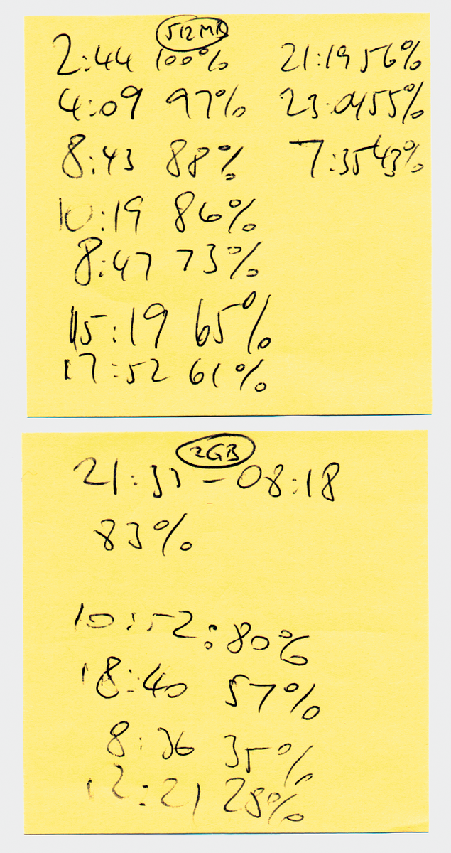
First, I refitted the old memory module, suspended the computer, and read the battery status of the reanimated machine at irregular intervals in the course of the next 36 hours. Figure 2 shows my hand-written notes: a list of discharge percentages and times.
One and a half days later, I repeated this procedure with the 2GB chip reinstated. The two sets of data use irregular and different measuring intervals because of the slightly unorthodox approach. To juxtapose the data graphically, as shown in Figure 3, I first had to run the script in Listing 1 to normalize the data before running the graph-discharge script in Listing 2.
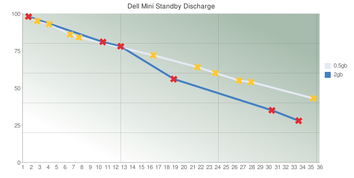
The results show that the batteries initially discharge at about the same speed with either memory chip. As the batteries approach the half-way point to exhaustion, the larger memory module causes the battery to discharge more quickly, which is not worrying, but it's nice to have the hard facts visualized in an attractive diagram.
| Listing 1: data-normalize |
001 #!/usr/local/bin/perl -w
002 use strict;
003 use DateTime;
004
005 my @result = ();
006 my $max    = {};
007
008 my $data = {
009   "2gb" => [
010     qw(
011   21:33 100 08:18 83 10:52 80
012   18:40 57  08:36 35 12:21 28
013       )
014   ],
015   "0.5gb" => [
016     qw(
017   14:44 100 16:09 97 18:08 95
018   20:43 88  22:19 86 08:47 73
019   15:19 65  17:52 61 21:19 56
020   23:04 55  07:35 43
021       )
022   ]
023 };
024
025 for my $conf ( keys %$data )
026 {
027
028   my $points =
029     $data->{$conf};
030   my $day_start;
031   my $day_current;
032
033   while (
034     my ( $time, $charge ) =
035     splice( @$points, 0, 2 )
036     )
037   {
038
039     my ( $hour, $minute ) =
040       split /:/, $time;
041
042     if (
043       !defined $day_start )
044     {
045       $day_start =
046         DateTime->today();
047       $day_start->set_hour(
048         $hour);
049       $day_start->set_minute(
050         $minute);
051       $day_current =
052         $day_start->clone();
053     }
054
055     my $time_current =
056       $day_current->clone();
057     $time_current->set_hour(
058       $hour);
059     $time_current
060       ->set_minute($minute);
061
062     if ( $time_current <
063       $day_current )
064     {
065       $time_current->add(
066         days => 1 );
067       $day_current->add(
068         days => 1 );
069     }
070
071     $day_current =
072       $time_current->clone();
073
074     my $x = (
075      $time_current->epoch() -
076      $day_start->epoch()
077     ) / 60;
078
079     push @result,
080       [ $conf, $x, $charge ];
081
082     if ( !exists $max->{x}
083       or $max->{x} < $x )
084     {
085       $max->{x} = $x;
086     }
087     if ( !exists $max->{y}
088       or $max->{y} <
089       $charge )
090     {
091       $max->{y} = $charge;
092     }
093   }
094 }
095
096 my $margin = 2;
097
098 for my $result (@result) {
099   my ( $symbol, $x, $y ) =
100     @$result;
101   print "$symbol ",
102     int( $x *
103       ( 100 - 2 * $margin ) /
104       $max->{x} ) + $margin,
105     " ",
106     int( $y *
107       ( 100 - 2 * $margin ) /
108       $max->{y} ) + $margin,
109     "\n";
110 }
|
The chart wasn't drawn by a program running on my local machine, but by a computer in a cluster, courtesy of Google.
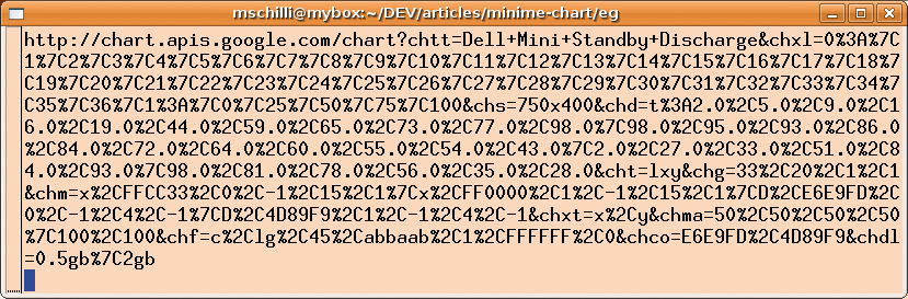
The Perl script simply creates a URL, as per Figure 4, and sends it to the Google Chart service, which returns a PNG-formatted image as a result. Google restricts you to 50,000 access attempts per day, which is fine for this example.
In a previous Perl column [2] I used the service to locate spammers on a map of the world.
To construct the URL in Figure 4, the budding chart builder has to follow the Google Chart Developer's Guide [3] carefully and encode various rules painstakingly in hard-to-read abbreviations. To make this easier, CPAN offers the Google::Chart module, which gives you an object-oriented interface to define the chart. It builds the URL step by step with the use of easily understandable method calls.
But before I start defining the chart, I first need to consolidate the measurements.
During my measurements, I read off the battery discharge values at irregular intervals that do not coincide for the two memory chips. To juxtapose the two discharge curves for a direct comparison, the data-normalize script (Listing 1) pushes the times onto a common time axis. Both sets of measurements then start at a virtual hour 0.
Starting with absolute points in time, the script calculates relative times by subtracting the virtual starting time.
For example, if the first set includes measurements at 8:00 and 9:00 and the second set has values for 11:00 and 11:30, the shared virtual time axis would start at 0:00 and include a second data point for set 2 at 0:30 and for set 1 at 1:00.
To do so, the data-normalize script uses the $data structure, which contains a reference to a hash with keys "2gb" and "0.5gb", each referencing an array containing points with pairs of time and battery capacity.
The goal of this approach is to start the two graphs at a common point and normalize both the time values on the X axis and the measured battery capacity values on the Y axis within an integer range of 0 through 100, as the Chart service expects of the data.
The script uses the CPAN DateTime module for these calculations and sets the time of the first, randomly selected, series of measurements as the starting point of the common time axis as $day_start. It stores the time of the current measurement as $time_current, whereas the day on which the last measurement was performed is stored as $day_current.
If the script finds out that a day has passed between two measurements (for example if a measurement at 23:00 is followed by a measurement at 8:00), lines 65 and 67 add a day to the counters. Lines 74 to 77 ascertain the number of minutes since the last measurement and stores the value in the variable $x (for X axis values), where it is picked up in line 80 and dumped into the @results array, along with the name of the set of measurements and the current battery value.
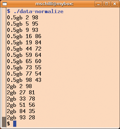
Lines 85 and 91 keep the highest X and Y values and stores them in the $max->{x} and $max->{y} hash entries, respectively. They are used later in the for loop in lines 98ff. to normalize all the X/Y values within a range of 0 to 100. Additionally, the $margin variable creates a margin with a width of 2 on the right and left before data-normalize finally normalizes the X/Y values within a range of 2 and 98. The reason for this becomes apparent in the chart later on; it just looks better if the graphs don't touch the horizontal and vertical axes. The print statement in line 101 sends the results to STDOUT (Figure 5).
While looking for a suitable chart format, I found the "lxy" type [3], which expects a set of X and Y coordinates for any drawn line. This makes it fundamentally different from other formats, which assume that the measured values are on the same X coordinates for any records they visualize. Line 26 in graph-discharge thus defines `XY' for the type option in the constructor call for a new Google::Chart type object.
Listing 2 first reads the output from the data-normalize script (line 10) and sorts the X and Y values into the $data structure. At the end of the while loop in line 21, $data->{"0.5gb"}->{x} contains all the normalized time stamps for the 512MB configuration, and $data->{"0.5gb"}->{y} is an array of the corresponding battery states. This makes it easy to pass a pointer to an array of X/Y records to the Google::Chart object's data parameter in line 28, just as the XY chart type expects.
The size parameter (line 35) sets the dimensions of the chart: 750 by 400 is about the maximum; if you try for larger dimensions, Google objects and returns a "Bad Request" message.
The chart title, which is displayed at the top of the chart, is set by the title option in line 39.
| Listing 2: graph-discharge |
001 #!/usr/local/bin/perl -w
002 use strict;
003
004 use Google::Chart;
005 use Google::Chart::Marker;
006
007 my $data = {};
008
009 open PIPE,
010   "./data-normalize |"
011   or die;
012 while (<PIPE>) {
013   chomp;
014   my ( $symbol, $x, $y ) =
015     split ' ', $_;
016   next unless $y;
017   push @{ $data->{$symbol}
018       ->{x} }, $x;
019   push @{ $data->{$symbol}
020       ->{y} }, $y;
021 }
022 close PIPE or die;
023
024 my $graph =
025   Google::Chart->new(
026   type => 'XY',
027
028   data => [
029     $data->{"0.5gb"}->{x},
030     $data->{"0.5gb"}->{y},
031     $data->{"2gb"}->{x},
032     $data->{"2gb"}->{y},
033   ],
034
035   size => '750x400',
036
037   title => {
038     text =>
039 "Dell Mini Standby Discharge"
040   },
041
042   fill => {
043     module =>
044       "LinearGradient",
045     args => {
046       target  => "c",
047       angle   => 45,
048       color1  => "abbaab",
049       offset1 => 1,
050       color2  => "FFFFFF",
051       offset2 => 0,
052     }
053   },
054
055   grid => {
056     x_step_size => 33,
057     y_step_size => 20,
058   },
059
060   axis => [
061     {
062       location => 'x',
063       labels => [ 1 .. 36 ],
064     },
065     {
066       location => 'y',
067       labels   => [
068         0, 25, 50, 75,
069         100
070       ],
071     },
072   ],
073
074   color =>
075     [ 'E6E9FD', '4D89F9' ],
076
077   legend =>
078     [ '0.5gb', '2gb' ],
079
080   margin => [
081     50,  50, 50, 50,
082     100, 100
083   ],
084
085   marker =>
086     Google::Chart::Marker
087     ->new(
088     markerset => [
089       {
090         marker_type => 'x',
091         color   => 'FFCC33',
092         dataset => 0,
093         datapoint => -1,
094         size      => 15,
095         priority  => 1,
096       },
097       {
098         marker_type => 'x',
099         color   => 'FF0000',
100         dataset => 1,
101         datapoint => -1,
102         size      => 15,
103         priority  => 1,
104       },
105       {
106         marker_type => 'D',
107         color => 'E6E9FD',
108             # light blue
109         dataset   => 0,
110         datapoint => -1,
111         size      => 4,
112         priority  => -1,
113       },
114       {
115         marker_type => 'D',
116         color =>
117           '4D89F9',    # blue
118         dataset   => 1,
119         datapoint => -1,
120         size      => 4,
121         priority  => -1,
122       },
123     ]
124     ),
125   );
126
127 $graph->render_to_file(
128   filename => "chart.png" );
129 system("eog chart.png");
130
|
To replace the plain white chart background with a more professional looking white to olive gradient, the fill option in line 42 sets the background to "LinearGradient". As you can read in the Colors section [3], you need a "c" value to fill the chart area; color1 and color2 expect two hex-encoded RGB colors. If the offset value is 0, the corresponding color is pure at the left of the chart and washed out at the right. A value of 1 lets the gradient run from right to left. The values in lines 46 through 51 thus define a chart background with a gradient from white on the left to full olive on the right. An angle of 45 degrees defines a gradient that runs diagonally from bottom left to top right.
The grid option (line 55) draws a grid in the chart, dividing the total elapsed time of approximately 36 hours in the X direction into three sections of 33 parts of 100. In the Y direction, horizontal lines are spaced 20 points apart. The axis labeling for the chart is defined by the axis parameter in line 60. The X axis is labeled with hour values from 1 to 36 at equal distances; the Y axis is labeled with the values 0 through 100 in steps of 25. Note that this labeling is entirely independent of the records you pass in; the data is normalized within a range of 1 through 100 for both axes.
The line colors for both sets of records are defined by the color option in line 75 in the order of data input. E6E9FD is a light blue, whereas 4D89F9 is more of a sky blue.
To allow the viewer to interpret the charts, legend in line 77 draws a legend on the right-hand side of the chart, depicting squares matching the line colors along with the name of the corresponding set of measurements.
To avoid the axes in the chart bumping against the edge of the image, the margin option in line 80 sets a border of 50 pixels in all directions. The last two values, both of which are 100, set the gap for the legend in the X direction from the right margin and the gap between the top of the graph and the automatically selected legend display location in the Y direction.
If you would like to see the individual data points drawn as crosses, you can set the marker option as shown in line 85. The first two elements in markerset define the appearance of the crosses for the first and second data sets, which you can specify as dataset => 0 and dataset => 1. If datapoint is set to -1, the chart service will draw every single data point, but you can use a selection instead. Markers with a priority of 1 are drawn last by graph-discharge, thus ensuring that the graph lines do not cover the crosses.
If the lines in the chart are below your aesthetic standards, because you prefer thicker lines, for example, you can use a marker setting here that is slightly non-intuitive. Instead of using `x' as the marker_type, a `D' entry sets line properties, such as thickness and color. In other words, if you prefer thicker lines in the chart, simply specify the same color as used previously with the color option in line 74 and set a marker thickness of 4. The -1 priority keeps the lines from obscuring any crosses by making sure they are drawn first.
Finally, the render_to_file method called in line 127 creates a URL as per Figure 4 and sends it to Google, which sends back the results in about one second as a PNG-formatted file that is stored on your disk under the specified file name.
The Google::Chart module is available from CPAN and requires the postmodern Moose object system (see the "Postmodern Programming" box), which in turn necessitates a whole rat-tail of dependencies; it is thus a good idea to use a CPAN shell or a package manager. When this issue went to print, Google::Chart was still lacking a couple of features, but after a short talk with the developers, they quickly took my patches from the GitHub.com [4] collaboration page and applied them to the 0.05014_01 developer version, which, along with the stable release, is available for download [5]. Long live GitHub: the dawn of a new age of open source collaboration!
| Postmodern Computing |
|
Larry Wall, creator of Perl, first expounded on Perl as a postmodern language in his 1999 Linux World talk [6]. Unlike modernism, which he says looks at things in isolation, postmodernism looks at the big picture. Modern computer languages take a concept (objects, stack code, parentheses) and drive it into the ground. Postmodern languages integrate many concepts, allowing each to work in its own way. "The Modernist believes in OR more than AND. Postmodernists believe in AND more than OR." In short, he said, postmodernists choose, without the need to justify their choices, "what rules and what sucks." By extension, then, Linux and the open source movement are postmodern. |
| INFO |
|
[1] Listings for this article: ftp://ftp.linux-magazin.com/pub/listings/magazine/105
[2] "Perl: Pinpointing Spammers" by Michael Schilli, Linux Pro Magazine, March 2009, pg. 74 [3] Google Chart API Developer's Guide: http://code.google.com/apis/chart [4] GitHub project for the Google::Chart module: http://github.com/lestrrat/google-chart/tree/master [5] CPAN version of the Google::Chart module (including 0.05014_01 trial version): http://search.cpan.org/dist/Google-Chart [6] Perl, the first postmodern computer language: http://www.perl.com/lpt/a/109 |