By Joachim Breitner
Most people who need to add pictographs to their texts tend to use an image format, and word processors such as OpenOffice.org Writer simplify this task by offering a plethora of positioning and formatting options. Despite these options, keeping the symbols consistent and making sure they match the typeface can be difficult, especially if you are using a large number of symbols, and images can be displaced easily during copy-and-paste actions. A far more convenient method is to define pictographs as characters in a font. With this approach, characters are firmly anchored in the body text, can easily be copied with the text, and will scale to match the font size. This method is far easier to handle, especially for automatically generated documents.
In this article, I will create a TrueType font that contains the two familiar pictograms for "woman" and "man," but I will add slightly smaller variants for "girl" and "boy." Also, I think it would be nice to have a filled and outline version of each of these symbols. I use these characters to represent relationships in a family tree, but I'm sure there are no end of applications for them. If your artistic talent is not up to this task, you can look for a template for your drawings. Just as an example, the US National Park Service offers a free template for the public convenience pictogram on park maps [1]. You can download the PDF and then use Inkscape to cut out the female and male pictograms (Figure 1), paste them into a new Inkscape window, and store them in two .eps files.
| TrueType and OpenType |
|
TrueType has established itself as a font format on modern desktop systems. It stores the outlines of the individual glyphs (screen characters) as vector graphics, allowing them to be printed without fraying at any resolution you need. TrueType uses quadratic splines for the vector files. Files with a suffix of .ttf can also comply with the OpenType standard. OpenType is an extended TrueType that includes improved Unicode support and important features for languages such as Arabic, in which the shape of a character depends on the neighboring characters in the text. |
Here's where FontForge [2] comes in. The program, which is available under the BSD license, is easily installed on Debian and Ubuntu by entering apt-get install fontforge. It is also available as an RPM package for Mac OS X and Cygwin or as a source code archive. I am using version 2009-09-23 for this article.
After launching the program, you are taken to an Open Font dialog with a New button at the bottom. The first step is to type a name for the new font in Element | Font info - for example, ManPictogram - in the Fontname field of this dialog box. The program automatically adds the Family Name and Name for Humans.
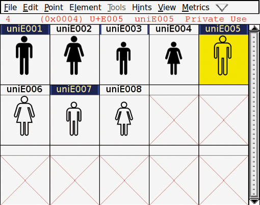
By default, FontForge uses an encoding that includes all characters in western languages. This is not suitable for our symbol font, which we will need to position at Unicode addresses U+E001 through U+E008 - the Private Use Area. To make these addresses visible, select Encoding | Reencode | ISO 106461-1 (Unicode, BMP) and then either select View | Goto to jump to the uniE001 glyph or just scroll down to it.
Now you can create your first glyph. The editor is launched when you double-click the first uniE001 slot. Selecting File | Import lets you load the man.eps file you stored previously. You can ignore the warning about not being able to read the countdictstack.
The man pictogram will appear in the editor, but notice that his head is not filled (Figure 2). That's because I imported two unconnected nodes instead of a single node. To correct this, drag the mouse to select both nodes and then select Edit | Join in the menu. The head should be filled now.
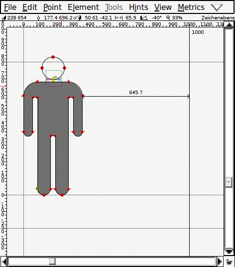
In the editor, you can see three horizontal lines and two vertical lines. The central, horizontal line represents the baseline on which letters without descenders sit. The top line marks the maximum height of a glyph, whereas the bottom line shows you how much space you have for descenders - for example, in characters like y or g.
The man in my EPS file is obviously too large, but you can quickly load the scaling tool (Scale the selection) from the toolbox to correct this. To do so, position the figure on the baseline (you can check that you have gotten this right by looking at the line below the menu bar), hold down the mouse button, and drag the mouse down and to the left until the head fits in below the top line. Holding down the Shift key will keep the aspect, that is, scale the man evenly in vertical and horizontal direction.
The vertical lines give you the glyph width. It is normal to leave a slight gap between the character and the delimiting line. To achieve precise results, you should not scale and move the man figure manually, but use Metrics | Set width to a width of 400 and then center the glyph by selecting Metrics | Center in Width.
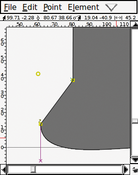
The imported EPS file has another problem. The outer point on the left foot (from the user's point of view) exists three times: the top two are part of the outline and the third point is isolated (Figure 3). To select this point without displacing the top points, you can use Edit | Select | Select Open Contours to safely delete the point. The problem with the other two points is easily solved by clicking to select one of the points and then pressing Edit | Merge to merge it with the other point.
FontForge can automatically identify other issues, such as points that are almost, but not quite, vertically aligned. The Element | Find Problems dialog offers a large selection of possible bugs and error sources. Set All checks them all once and will automatically Fix anything it can (Figure 4). You can ignore the The glyph's advance width is different from the standard width message because you haven't set a standard width. The tool will also add new points, and you should run it multiple times until it doesn't come up with any new errors. FontForge automatically generates hints that will later help the display program keep the legs the same width even at low resolutions. If the blue lines bother you, remove them by selecting Hints | Clear HStem and Hints | Clear VStem. The program can create these hints again when you generate the font file.
This completes the first character. Now you can close the window and open the editor for the next slot, uniE002, by double-clicking it. Next, import the woman pictogram and repeat the steps you just worked through. You should set the width to 450 to account for the pictogram being slightly wider to accommodate the figure's skirt.
To create the child pictograms, we can define a reference to the parent glyphs and simply change the size. This saves memory space, and any changes you make to the parent pictograms later will also be reflected in the child pictograms.
To begin, select the male character in the main window. Then press Edit | Copy Reference, select slot uniE003, and create the reference by pressing Edit | Paste. The reference is shown as slightly lighter in the glyph editor, and you cannot edit the individual nodes. Instead of doing that, I will scale the glyph by selecting Element | Transformations | Transform. Select Glyph Origin as the Origin and Scale Uniformly as the transformation with a value of 85%.
Unfortunately, in the version of FontForge I was using, the Transform Width Too item didn't work if scaling was based on the origin. To correct this, I had to scale the glyph width by the same factor with Metrics | Set Width. After doing this, you can create the pictogram for the girl in slot uniE004 based on the glyph in uniE002.
In addition to the filled glyphs, I wanted the font to include outline variants. Again, FontForge can help me. In the main window, just copy the uniE001 character, insert it into slot uniE005, and select Element | Expand Stroke. This function lets users create lines with calligraphic effects besides normal strokes, but in this case, all I need is a simple Stroke. Because the glyphs do not have open contours, the Line Cap setting is irrelevant. However, I need to use Line Join at all the sharp corners, such as the man's armpits and the bottom of the woman's skirt. In this case, Miter is a useful choice. You can experiment with the Stroke Width; 20 turned out to be a good choice in my case.
Follow the same approach to create the female outline glyph in slot uniE006. Note that you can't create an outline character from a reference for the child characters. Instead, you need to convert the reference copy into a normal copy by selecting Edit | Unlink Reference after copying the reference. You could also create the smaller outline glyphs as scaled-down references of the larger characters, but this would make the lines thinner, which we don't want. The results of these steps are shown in Figure 5.
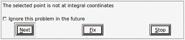
Besides the ability to find problems, FontForge also offers an Element | Validation | Validate item. This option will, for example, discover that the four outline glyphs have control points with non-integral coordinates. Here, you need to select the four outline glyphs and select To int in the drop-down menu. The strokes for the head and the body also overlap. To resolve this, select Element | Overlap | Remove Overlap. Just ignore the Glyph contains overlapped hint and Missing BlueValues entry messages, unless you are creating PostScript fonts.
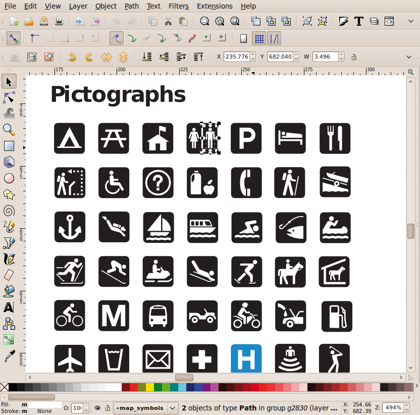
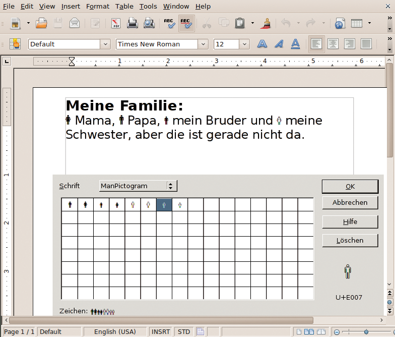
Now you can create the font file. Select the TrueType font format in the dialog that appears when you select File | Generate Fonts, then save the font as ManPictogram.ttf. The file is now a pictogram font. If you copy it to ~/.fonts, you will be able to use the pictograms in OpenOffice.org (Figure 6), for example.
FontForge is a powerful tool. Easy fonts are created quickly, but a full-fledged text font is more complex and requires background knowledge of typography. Besides generating all the letters and characters, you also have to consider kerning and ligatures. Fortunately, the FontForge homepage has an exhaustive reference.
| INFO |
|
[1] National Park Service map symbols: http://www.nps.gov/hfc/carto/map-symbols.htm
[2] FontForge: http://fontforge.sourceforge.net/ |