
Rumor has it that 2009 is the year of the Linux desktop. With KDE 4.2, the next step in the evolution of the popular desktop environment, it may well be.
That is very impressive, François! I wasn't expecting to see a series of murals when I walked in, but there they are. What exactly am I looking at? You want me to guess, do you? Well, if I had to guess, I would say it looks like a series of tables from the prehistoric to the present, with place settings to match. Thank you, François. I particularly love that stone-age table with the bone utensils, but I still don't get the point. What made you do this? The evolution of the tabletop theme of today's menu? Non, non, non, François. That's evolution of the desktop, as in a Linux computer desktop.
François, don't look so sad. It's still quite an impressive oeuvre. Besides, our guests are arriving and there's no time to change things. Quickly, put a smile on your face and get ready.
Welcome, mes amis, to Chez Marcel, the home where fine wine is paired with delectable open-source software. Please sit and make yourselves comfortable. While you find your tables, perhaps François could make his way to the wine cellar. Check the north wing, mon ami, and you'll find a few cases of 2005 Gessinger Zeltinger Sonnenuhr Riesling from Germany. Vite!
There have been numerous improvements and enhancements in this new version of KDE, too many to cover them all in the space I have, so I'll give you a sampler of what you can expect. Think of it as a KDE 4.2 buffet table.
Everyone (well, almost everyone) loves fancy desktop effects. Flash and pizzazz are the order of the day with modern desktops, and KDE 4.2 doesn't lack there. To help with the seemingly mandatory collection of desktop special effects, KDE 4.2 now detects your graphic card's capabilities. If the card supports the compositing effects, they are turned on automatically.
Let's tour this new desktop and take a look at a few of the more interesting changes. In the December 2008 issue of Linux Journal, I told you about those cool little desktop gadgets, or widgets, called plasmoids. By way of a quick recap, KDE's new desktop isn't so much a desktop as a shell that runs other applications. It's called Plasma. Plasma runs small applications called plasmoids, though they also are referred to as widgets and even gadgets. Each one of those plasmoids is, like the Plasma shell, a container that can contain other plasmoids. Imagine turtles standing on top of one another, and you'll start to get the idea. One of KDE 4.2's enhancements is the sheer number of widgets it can run and the different types of widgets that it includes.
Click the plasma cashew icon in the top right-hand corner of your desktop, and select Add Widgets. When the Add Widgets window appears (Figure 1), you can select widgets included with KDE 4.2. To install from other sources (including Mac OS X dashboard widgets, among others), click the Install New Widgets button, and then choose Install Widget from Local File.
While we are on the subject of plasmoids, I must tell you about what was probably the most controversial change to accompany KDE 4.0: the so-called missing desktop icons. This became a controversy because desktop icons are simply files and folders in a special folder called Desktop. To display the icons on the desktop (or in the Desktop folder), you would need a plasmoid whose entire job in life was to display the contents of the Desktop folder.
A storm ensued. I personally don't like icons on my desktop, but apparently, many (if not most) people do, and the KDE team heard about it—a lot. To calm this storm, they created the plasmoid I just mentioned—the one that would display the contents of the Desktop folder (or any folder for that matter). It's called Folder View (Figure 2).
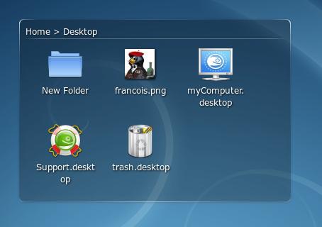
Figure 2. Your old desktop icons, safely ensconced in the Folder View plasmoid.
Your plasma desktop can have multiple configurations to help you with whatever work you might happen to be doing. These are called activities, and you can add new ones by clicking that cashew-like icon in the top right-hand corner of your desktop (Figure 3). Two of these activities are defined for you by default. One provides the, ahem, classic desktop view with the optional Folder View plasmoid. The other is called Folder View. It provides the kind of desktop view with which most people are familiar, one where you can right-click to add icons and shortcuts to programs, files or URLs.
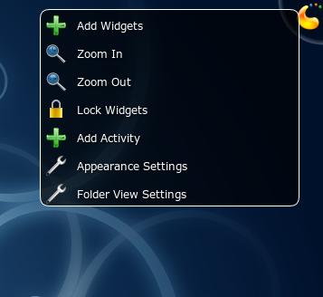
Figure 3. That little plasma cashew does so much, from changing your desktop theme to adding widgets (plasmoids), and even switching between—and adding—different activities.
To switch from one defined activity to the other, left-click on the plasma cashew icon in the top right, and select Appearance Settings. When the dialog appears, you can select a desktop theme, change your wallpaper and, yes, switch activities from desktop to Folder View (Figure 4). Incidentally, running your desktop session in Folder View mode doesn't preclude running the Folder View plasmoid. Both can coexist quite happily, as you can see in Figure 5. That's because the Folder View plasmoid isn't only for your Desktop folder. It could be anything you like.
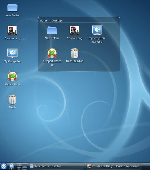
Figure 4. Getting your cake and eating it—icons on the desktop and a Folder View plasmoid live together in perfect harmony.
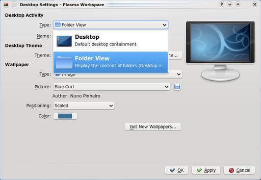
Figure 5. From the Desktop Settings dialog, you can switch desktop activities, along with the wallpaper, paint and so on.
All of this talk of activities is really just a means to keep things organized in a way that makes some kind of sense. In the bottom left-hand corner of the panel, you'll see a big K button. That's KDE's program launcher, called Kickoff (Figure 6). Kickoff may seem a bit alien at first, but you're going to love it. There are five animated tabs at the bottom of Kickoff window. Favorites is just what it sounds like—a list of favorite applications. By default, you'll see a small handful as provided by your distribution. Under the Applications tab, applications are listed under groups, such as Office, Games and so on. Click on a program group, and the window slides to the next level of application until you get a list of the programs themselves. If you regularly traverse the office menus to find OpenOffice.org's Impress program, you might want to add it to your Favorites tab. Simply right-click on the application, and select Add to Favorites.
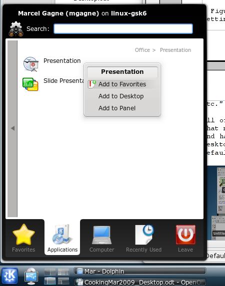
Figure 6. Kickoff is the new program launcher, a place to find your favorite applications, recently used files, system locations and a whole lot more.
Conversely, you also can remove applications from the Favorites list in a similar way. Simply right-click, and select Remove from Favorites. Under the Computer tab, you can access the System Settings—the master control from which you can change just about anything having to do with your system, from look and feel to sound, printing, networking (including file sharing), display settings and pretty much everything else. It also provides quick access to system locations, including your home folder, the root filesystem, network folders and so on. Recently Used covers both files and applications. The Leave tab is more than merely a way out. You can switch users, log out, shut down or suspend your notebook computer to RAM.
Let's look at another side of running applications. If you know the name of an application, you can, of course, just run it as a command. You also can press Alt-F2, and call up Krunner, a super-powerful program launcher that's a whole lot more (Figure 7). Start typing the name of a command, and Krunner supplies you with options, including program names and icons, before you finish typing. If you see what you like, just click and go.
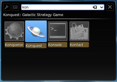
Figure 7. Krunner seems to read your mind and offers a number of options as you type your command name.
On Krunner's top right, there's a wrench icon and a small rectangle with a wavy line running through it. Clicking the wrench provides you with a means of configuring Krunner's many plugins. Yes, Krunner can do math, look up recently used Web pages, do a desktop search and run commands too. Click the squiggly line box, and you'll fire up a process monitor (Figure 8). At a glance, you can see every process running under your desktop, including the amount of CPU and memory it is using (both system and shared). Hover over a program name with your mouse to discover more information. You also can kill a process from the same window.
If you are the sort of person who needs to build a large list of program favorites, you'll understand the usefulness of what I'm going to show you next. Yes, some of us run an awful lot of applications simultaneously and have, historically, dealt with all those applications by running eight or ten virtual desktops, as opposed to the default four that most distributions give us (some default to two). By default, the top left-hand corner is a hot spot for the mouse. Assuming that you have the desktop effects turned on (true with a compositing capable graphics card), your active applications will all fall flat, side by side, against the desktop background (Figure 9). From there, you easily can see what you have open and quickly switch to it.
Pressing the keyboard shortcut Ctrl-F10 works the same way. You also can choose to view only those applications from your current virtual desktop by pressing Ctrl-F9. Flipping between applications is where you may be used to pressing Alt-Tab. This still works under KDE 4.2, but you may want to select a different behavior and a different effect. I'm rather fond of the cover switch effect where windows flip past you with the current choice facing you (Figure 10). It's a little like flipping through albums (remember vinyl?) or CDs at the music store.
Doing many things at the same time, that old multitasking demon, can create quite the clutter. Imagine you are copying a number of large files from one folder to another or from one system to another. Historically, you would see a number of little progress boxes telling you how each of those copies was progressing. On the right-hand side of the panel, KDE 4.2 now provides an enhanced system tray that multitasks as a notification area, so you can check the progress of those events or just hide them out of the way (Figure 11). The system tray also is configurable with a right-click so you can hide icons you rarely or never use.
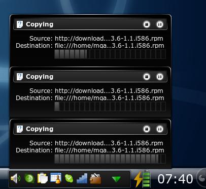
Figure 11. The notification area can swallow all those progress windows, keeping your desktop clean while you multitask.
Now you've seen the right-hand side of the panel and the left. You might have noticed that on the far left, there's another one of those plasma cashews ready for some action. If you don't see it, it may be locked. Press Ctrl-L to unlock it and make the cashew appear. Right-click on the cashew, and you can add widgets (plasmoids) to the panel, change basic settings and add or remove another panel. Left-click, and you now are able to change the width and height of the panel. Click the More Settings button, and a host of other settings can be changed—from auto-hiding to alignment to window/panel behavior (Figure 12).
KDE 4.2 is, of course, not only a desktop environment, but also a collection of applications. Some of those applications truly shine in KDE 4.2, providing functionality like never before. One of these applications is Marble, the desktop globe (which I wrote about in the February 2008 issue of Linux Journal). Marble was more of a toy than anything else in its early days (albeit a very cool toy), but it too has evolved. The current release is fully integrated with the OpenStreetMap Project, which means you can search for a location anywhere on the planet, and if it is in the OpenStreetMap database, you can zoom in on that location (Figure 13).
OpenStreetMap, in case you didn't know, is a collaborative project involving tens of thousands of people worldwide whose goal it is to create and maintain a free editable map of the world. Although the project is considerably more complex than this short explanation can provide, people literally walk the planet with GPS devices, uploading data to the project. There also are organizations that contribute public domain map data, which is then further enhanced by project volunteers. Groups get together for mapping parties. It's great fun. But I digress....
Almost every application has been updated and improved in sometimes subtle, but important ways in KDE 4.2. The task manager in the bottom panel now has a preview of the running applications. Dolphin is the KDE file manager, and although it operates in much the same way that it has for some time, the polish is noticeable there as well. The file view now has a preview of the document or image with a slider along the bottom to increase or decrease the size of the preview (Figure 14).
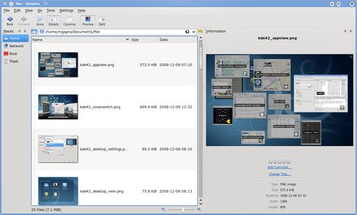
Figure 14. Dolphin now has a cool preview in file mode with a handy slider to define the preview size.
On the admin side, things have improved as well. KDE now comes with PowerDevil, a new power management console that makes mobile life much more flexible (Figure 15). For instance, you can create profiles to define how power management (such as screen blanking, suspend and so on) behaves under different conditions. You might be doing a presentation, for instance, and taking questions while your notebook sits idle. PowerDevil would let you define a profile where the notebook wouldn't just suspend or go dark while it is idle.
There are so many changes in this new KDE that it's difficult to know when to stop. The article clock, however, has other ideas. There are new games, new desktop effects, new configurations and new everything.
It's easy to think of Linux desktop environments as consisting of only GNOME and KDE, but there are many more. Those two, however, GNOME and KDE, certainly are the most popular and powerful. Both environments evolve with each new release. With the release of KDE 4.2, and the 4.X branch in general, the Linux desktop has been dramatically re-imagined, re-engineered and redesigned. Whether you decide it's the environment for you or not, this may well be the pinnacle of Linux desktop evolution—at least for now. Speaking of now, it most certainly is closing time, and I see that François is refilling your glasses a final time. Please, mes amis, raise your glasses, and let us all drink to one another's health. A votre santé! Bon appétit!