Experienced with front-end development but new to Drupal? Good with Drupal configuration but shy about theming? Read on to find out how to get started with custom themes, working with templates, JavaScript and CSS, considerations for mobile and tips for performance. Plus, learn what's next in Drupal 8.
Drupal allows you to set up a site in no time and lets you focus on what really matters—content. With Drupal, front-end developers can eliminate most of the boilerplate code and jump right in to styling (otherwise known as “theming”) fairly quickly. Drupal provides you with the base, markup and most of the needed functionality right out of the box.
This article, written by a seasoned Drupal front-end developer, intends to walk you through the must-know Drupal front-end development techniques and best practices, specifically as related to the latest stable version, Drupal 7. This article covers the basics on how to create a custom theme from scratch and how to enhance it in different ways with JavaScript and Media Queries for mobile support. It explains the administration interface and shows ways to design pages using modules—for example, Panels. Finally, it covers performance issues and offers pointers on what to expect in the next version, Drupal 8.
There are two ways of theming a Drupal site. One, use a base theme that provides most layout and functionality needs in combination with a sub-theme for custom styles. The main benefits of using a contributed base theme include 1) theme settings in the administrator interface, 2) multi-column layout options, 3) predefined print style sheets, 4) contextual classes added to the markup and 5) cross-browser compatibility fixes.
Or, option two, you can create a theme from scratch and control, in detail, everything in the theme layer and add features as needed. I personally like having total control of what is in my theme; therefore, I always create a theme from scratch. I think every project deserves this treatment, so, keeping that in mind, let's explore a creating custom theme and compare it with a base theme, so you can decide your preferred approach.
Creating Drupal themes from scratch is easier that it sounds. What do you need? A folder and an .info file will get you started:
Create a folder in /sites/all/themes.
Name the folder with the name of the theme. The name should be all lowercase with no spaces—for example, /sites/all/themes/cooltheme.
Create a new document with your preferred text editor or IDE.
Add some base settings to this document (see below).
Save the document inside the newly created theme folder.
Name the document the same as the folder plus the .info extension—for example, cooltheme.info.
Here are the .info base settings:
name = cooltheme
description = Description of the theme.
core = 7.x
engine = phptemplate
regions[left] = Left sidebar
regions[content] = Content
regions[header] = Header
regions[footer] = Footer
Once the theme has these components, enable it from the administration interface. On the Drupal toolbar, click on appearance (URL: /admin/appearance). The new custom theme should be listed on this page; enable it, and set it as the default.
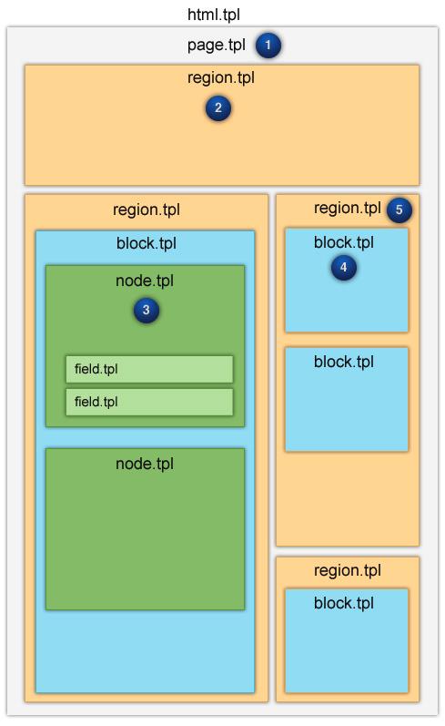
Drupal's API allows for customization of any of the page's areas in a very modular way. Customize the page wrapper (html.tpl.php), the page itself (page.tpl.php), regions within the page (region.tpl.php), blocks within regions (block.tpl.php), nodes (node.tpl.php) and fields within nodes (field.tpl.php). Add these files to the theme folder if you want to override the templates. You can get these templates from core modules like node, blocks and field. Simply copy and paste the templates inside the theme's folder, and let the overriding begin!
Note: make sure to clear Drupal's cache when adding a new template or editing the .info file. On the Drupal toolbar, click on Configuration→Performance→Clear all caches (URL: admin/config/development/performance).
Are you connecting the dots already? As shown in Figure 1, there are many regions defined in the .info file. See what content displays in the regions by going to the block page in the administration interface. On the Drupal toolbar, click on Structure→Blocks (URL: /admin/structure/blocks).

Figure 1. Drupal's File Template System Hierarchy and Priority
To get started styling your site, create a folder called css inside the theme's folder. In there, you can add all the stylesheets and then reference them from the .info file by adding the following line(s):
stylesheets[all][] = css/style.css
stylesheets[all][] = css/layout.css
stylesheets[all][] = css/etc.css
Do you ever need to do a “one-second” CSS change remotely? Before when doing that you needed to download or pull the code, make the edit, and upload or push, right? This incredible module called Live CSS (drupal.org/project/live_css) allows you to edit CSS or LESS live within the page, and save the changes back to the file instantly. This tool is very handy when developing a Drupal site. There's no need to switch back from the text editor or IDE to the browser and refresh the page. All of your edits happen right away.
JavaScript adds behavior and interaction to the theme. Popular JavaScript libraries like jQuery and jQuery UI already come with Drupal. To add custom JavaScript code, first create a folder called js inside the theme's folder. Then, simply add JavaScript files to the js folder and reference them in the theme .info file by adding the following:
scripts[] = js/main.js
scripts[] = js/etc.js
You also can use Drupal's PHP function drupal_add_js in the template.php file as follows:
<?php
function example_preprocess_html(&$variables) {
  $options = array(
	'group' => JS_THEME,
  );
  drupal_add_js(drupal_get_path('theme', 'example'). '/script.js',
  ↪$options);
}
?>
Once the JavaScript file is referenced in the theme, start adding behavior and interaction to the theme. Best practice is to wrap the JavaScript code inside a jQuery closure function—something like this:
(function($) {
    // Javascript code
}) (jQuery);
But wait, doesn't Drupal's API provide support for JavaScript? Yes, it actually provides specific JavaScript functions through jQuery. So, you can pass information from the PHP code and attach Drupal-specific behaviors with something like this:
(function($) {
   Drupal.behaviors.customToggler = {
     attach: function(context, settings){
        $(".toggler", context).once('custom-toggler').click(function(){
          $(this).next().slideToggle("slow");
          return false;
        }).next().hide();
      };
    };
})(jQuery);
If you're using modules that include other JavaScript libraries, such as MooTools or YUI, use jQuery's $.noConflict() function to avoid confusion over the famous dollar-sign alias ($).
To practice progressive enhancement like some of us do, explore Modernizr. Adding Modernizr to your project is as easy as installing the Modernizr module from drupal.org (drupal.org/project/modernizr). Modernizr is a JavaScript library that detects HTML5 and CSS3 features in the user's browser.
When optimizing a Drupal Web site for mobile, it is possible to create a sub-theme with all mobile features. This allows control of the experience of the mobile site vs. the desktop site. Drupal offers a few things to make the job easier. For starters, modules like ThemeKey will allow a switch to the mobile sub-theme when the user is accessing the Web site from a mobile device.
Drupal is “technology-agnostic” regarding the front-end technology, so making a responsive Web site in Drupal is mostly the same as with any other platform. Define the media queries in the CSS file, or simply add them to the .info file as follows:
stylesheets[all and (max-device-width: 480px)][] = mobile.css
Other Drupal modules like Adaptive Images will play nicely with Drupal's Image Styles module to create, cache and deliver device-appropriate re-scaled versions of the site's embedded images automatically.
Now that you have a custom theme in place, let's look at what the Drupal administration interface offers to front-end developers. Repetitive development tasks like applying custom filters to images, embedding custom fonts and defining custom layouts have never been easier than they are with Drupal!
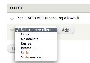
The image styles module comes with Drupal out the box. With this module, you can create image instances of the original image and apply effects to those instances dynamically—no more Photoshop batch scripts; let Drupal do it for you, on the Web.
Effects include:
Crop
Desaturate
Resize
Rotate
Scale
Scale and crop
Other effects, such as watermarking, overlays, brighten/darken, rounded corners and many more, are available via the ImageCache Actions contributed module (drupal.org/project/imagecache_actions).
From the Drupal toolbar, click on Configuration→Image styles (URL: admin/config/media/image-styles).

Figure 2. Drupal Core's Image Styles Module Administration Screen for Presets
This module provides an administrative interface for browsing and applying Web fonts embedded via CSS from a variety of sources and font providers, such as the following:
Adobe Edge Web Fonts
Font Squirrel
Fontdeck
Fonts.com
Google Fonts
Typekit.com
Here's the link: drupal.org/project/fonttheface. It also is possible to import local fonts in all Web formats: EOT, TTF, WOFF and SVG.
What about the idea of managing the icon fonts from the administration interface? With this module (drupal.org/project/iconfonts), you can do so. Install this module to get started with the font icon at IconMoon (icomoon.io) and bring it to Drupal in no time.
Those familiar with Google Fonts know how convenient it is to load the custom fonts in a site with a couple lines of code. Well, with Drupal, there is no need to to use those lines of code any more. Install the Google Fonts module, enable the desired fonts, map it to the CSS selectors from the Drupal administration interface and enjoy: drupal.org/project/google_fonts.
If you like the idea of being able to create customized page layouts and manage the content with a nice-and-neat drag-and-drop interface, the Panels module is for you. Explore it at drupal.org/project/panels.
With Panels, you can do the following:
Create customizable and re-usable layout for pages and blocks.
Insert the previously created content in any region.
Insert and create re-usable custom content in any region.
Customize the node pages and node forms at the field level.
Customize the user pages and user forms at the field level.
Edit and modify the order of the panes at all times with drag and drop.
Add conditional rules to hide or show the panes.
Switch panels based on context—for example: user role, is mobile and so on.
Add CSS classes and IDs.
Cache your panes individually.
Export the configuration as PHP code.
Now that the theme is ready and configurations on the administration interface are complete, there are a few things you can do to optimize the site's performance. Let's start with Drupal core's performance settings.
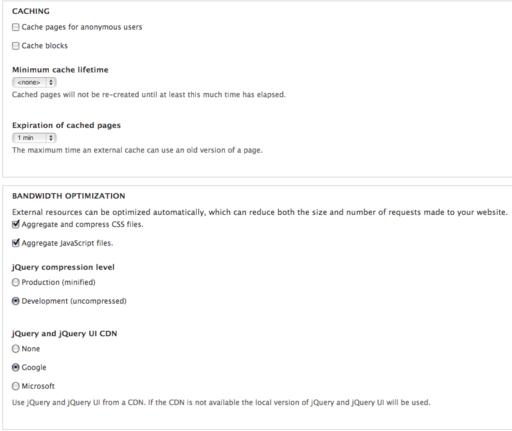
From the Drupal toolbar, click on Configuration→Performance (URL: admin/config/development/performance).

Figure 5. Drupal Core's Performance Administration Screen for Caching, File Aggregation, jQuery and jQuery UI CDN
On this screen, activate caching for anonymous users and blocks, CSS and JavaScript aggregation and jQuery and jQuery UI file compression and CDN options. By enabling caching and aggregation alone, the site performance increases significantly.
Furthermore, modules like Varnish, Boost and Memcache will offer more robust caching solutions. And, it is recommended to use a CDN in combination with the CDN module when high-performance is in order.
Note: for performance testing and analysis, visit: yslow.org.
How is Drupal moving forward, and in what areas will it benefit front-end development? There are three major initiatives for Drupal 8 that front-end developers should be very excited about: Design, HTML5 and Mobile.
The Drupal community has been improving the user experience constantly, and for version 8, they plan to take it another step further. As for HTML5 and mobile, the goal is to make HTML5 the default output and leverage it to make Drupal a fully mobile platform. Other unofficial initiatives like “Spark” may bring a responsive layout builder to Drupal 8. Stay tuned!
So, what have you learned? Although there are many benefits to using an out-of-the-box theme, it's worth it to explore creating a custom theme to have control of everything in the theme layer and features as needed. Take advantage of template overrides to craft markup, add custom CSS classes, and add behavior and interaction to pages with JavaScript. For mobile, you can create a sub-theme for mobile support or just simply use CSS3 Media Queries in support of responsive design. Before importing a third-party library in the theme, check whether a Drupal integration is available. Most likely a module already exists! Leverage design modules like image styles, custom fonts and panels. For performance, be sure to enable caching and aggregation, explore contributed caching modules and think about a CDN. Finally, get excited about the future. Drupal 8 will make everything even better for cross-device optimization. If you have any questions, please let me know: alex.castillo@door3.com.