 |  |

| |
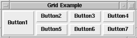
The grid geometry manager divides the window into a grid composed of columns and rows starting at (0, 0) in the upper-left corner. Figure 2-29 shows a sample grid.
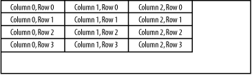
Rather than using the sides of a window as reference points, grid divides the screen into columns and rows. It looks a lot like a spreadsheet, doesn't it? Each widget is assigned a grid cell using the options available to grid.
The grid method takes a list of widgets instead of operating on only one widget at a time.[9] Here is the generic usage:
[9] Several people have mentioned that pack can also take a list of widgets. We don't cover this because it is not how pack is normally used.
$widget1->grid( [ $widget2, ... , ] [ option => value, ... ] );
A specific example is:
$widget1->grid($widget2, $widget3);
Instead of using three separate calls, you can use one grid call to display all three widgets. You can also invoke grid on each widget independently, just as you can pack. Each call to grid will create another row in the window. So in our example, $widget1, $widget2, and$widget3 will be placed in the first row. Another call to grid creates a second row. This is what happens when you do not specify any additional options to the grid call.
The previous example can be rewritten like this:
Tk::grid($widget1, $widget2, $widget3);
But beware, this is not necessarily equivalent to the previous statement, due to inheritance, an object-oriented concept. For more information, please refer to Chapter 14, "Creating Custom Widgets in Pure Perl/Tk". Essentially, using Tk::grid is the same as calling a subroutine directly, whereas the method call searches the widget's class hierarchy for a subroutine grid. It's certainly possible that $widget1 has its own special grid method, which we would rudely bypass. Is this a likely possibility? No. Just be aware when you make a procedural versus a method call.
For greater control, you can specify explicit -row and -column options for each widget in the window. We'll cover these options later.
When additional options are not specified, the following assumptions are made:
The first widget in the row (e.g., $widget1 in the preceding example) invokes the grid command.
All remaining widgets for that row will be specified as arguments to the grid command.
Each additional call to grid will add another row to the display.
Special characters can be used to change the -columnspan and -rowspan of the widget without using -columnspan or -rowspan explicitly.
A few examples will help demonstrate. Each call to grid creates another row, so in the following example we have two rows:
# Create two rows, each with four widgets
$widget1->grid($widget2, $widget3, $widget4);
$widget5->grid($widget6, $widget7, $widget8);
In this example, we have created four rows and there is only one widget in each row:
# Create four rows, each with one widget
$widget1->grid( );
$widget2->grid( );
$widget3->grid( );
$widget4->grid( );
We can also create widgets as we go:
$mw->Button(-text => 'Button1', -command => \&call1)->grid(
            $mw->Button(-text => 'Button2', -command => \&call2),
            $mw->Button(-text => 'Button3', -command => \&call3),
            $mw->Button(-text => 'Button4', -command => \&call4));
Pay careful attention, because the second, third, and fourth calls to Button are inside the call to grid. All four of the Buttons will be placed in the first row. If we execute the same command again, the new widgets are placed in the next row.
There are several special characters that can be used to alter the way the widgets are gridded in the window. Each special character serves as a type of placeholder that indicates what to do with that position in the grid:
The following sections include some examples that illustrate what the special characters do.
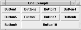
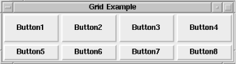
The following bit of code creates three rows of Buttons. The first two rows are normal and, in the third, the second Button spans three columns. Each "-" character adds one to the number of columns the Button uses, and the default is one. So the original column and two hyphens ("-","-") indicate that there are three columns to span. The -sticky option is necessary for the widgets to stick to the sides of the cells they span. If the -sticky option were left out, the Button would be centered across the three cells it spans.
$mw->Button(-text => "Button1", -command => sub { exit })->grid
  ($mw->Button(-text => "Button2", -command => sub { exit }),
   $mw->Button(-text => "Button3", -command => sub { exit }),
   $mw->Button(-text => "Button4", -command => sub { exit }));

$mw->Button(-text => "Button5", -command => sub { exit })->grid
  ($mw->Button(-text => "Button6", -command => sub { exit }),
   $mw->Button(-text => "Button7", -command => sub { exit }),
   $mw->Button(-text => "Button8", -command => sub { exit }));


$mw->Button(-text => "Button9", -command => sub { exit })->grid
  ($mw->Button(-text => "Button10", -command => sub { exit }),
   "-", "-",  -sticky => "nsew");
Figure 2-30 shows the resulting window.
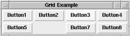
The "x" character translates to "skip this space" and leaves a hole in the grid. We removed the line that created Button6 and replaced it with an "x" in the following code. The cell is still there, it just doesn't contain a widget.
$mw->Button(-text => "Button1", -command => sub { exit })->grid
  ($mw->Button(-text => "Button2", -command => sub { exit }),
   $mw->Button(-text => "Button3", -command => sub { exit }),
   $mw->Button(-text => "Button4", -command => sub { exit }));

$mw->Button(-text => "Button5", -command => sub { exit })->grid
  ("x",
   $mw->Button(-text => "Button7", -command => sub { exit }),
   $mw->Button(-text => "Button8", -command => sub { exit }));
Figure 2-31 shows the resulting window.
The rest of the options are similar to those used with pack:
Rather than letting grid make assumptions, it is sometimes necessary to explicitly state the row and column in which the widget should be placed. This is done by using the -row and -column options. Each option takes a nonnegative integer as an argument:
-column => n, -row => m
When you use -row and -column, it is not necessary to build or grid the widgets in any sort of logical order (except for your own sanity when you are debugging). You could place your first widget in column 10 and row 5 if you like. All the other cells with lower row and column values will remain empty.
It is also possible to indicate explicitly that a widget (or widgets) should span some columns or rows. The option to span columns is -columnspan. For spanning rows, the option is -rowspan. Both options take an integer that is 1 or greater. The value indicates how many rows or columns should be spanned, including the row or column in which the widget is placed.
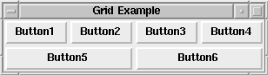
For this example, we use the easy way to place widgets in columns and rows by not explicitly specifying the -row and -column options. Note that the second grid command applies to two Button widgets, so the single -columnspan option applies to both Buttons created there.
$mw->Button(-text => "Button1", -command => sub { exit })->grid
  ($mw->Button(-text => "Button2", -command => sub { exit }),
   $mw->Button(-text => "Button3", -command => sub { exit }),
   $mw->Button(-text => "Button4", -command => sub { exit }),
   -sticky => "nsew");

# Button5 will span Columns 0-1 and Button6 will span 2-3
$mw->Button(-text => "Button5", -command => sub { exit })->grid
  ($mw->Button(-text => "Button6", -command => sub { exit }),
   -sticky => "nsew", -columnspan => 2);
The resulting window is shown in Figure 2-32.
This window could also have been created using the "-" special character to indicate column spanning, like this:
$mw->Button(-text => "Button1", -command => sub { exit })->grid
($mw->Button(-text => "Button2", -command => sub { exit }),
$mw->Button(-text => "Button3", -command => sub { exit }),
$mw->Button(-text => "Button4", -command => sub { exit }),
-sticky => "nsew");
# Button5 will span Columns 0-1 and Button6 will span 2-3
$mw->Button(-text => "Button5", -command => sub { exit })->grid
("-", $mw->Button(-text => "Button6", -command => sub { exit }), "-"
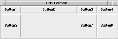
-sticky => "nsew");This example illustrates how to explicitly use the -row and -column options in addition to the -rowspan option:
$mw->Button(-text => "Button1", -command => sub { exit })->
  grid(-row => 0, -column => 0, -rowspan => 2, -sticky => 'nsew');
$mw->Button(-text => "Button2", -command => sub { exit })->
  grid(-row => 0, -column => 1);
$mw->Button(-text => "Button3", -command => sub { exit })->
  grid(-row => 0, -column => 2);
$mw->Button(-text => "Button4", -command => sub { exit })->
  grid(-row => 0, -column => 3);

$mw->Button(-text => "Button5", -command => sub { exit })->
  grid(-row => 1, -column => 1);
$mw->Button(-text => "Button6", -command => sub { exit })->
  grid(-row => 1, -column => 2);
$mw->Button(-text => "Button7", -command => sub { exit })->
  grid(-row => 1, -column => 3);
See Figure 2-33 for the resulting window.
When you use the pack command, it is necessary to indicate both -fill and -expand options to get the widget to resize inside its allocation rectangle. The grid command doesn't have an allocation rectangle to fill, but it does have the cell within the grid. Using the -sticky option with grid is similar to using -fill and -expand with pack.
The value associated with -sticky is a string containing the compass points to which the widget should "stick." If the widget should always "stick" to the top of the cell, you would use -sticky => "n". To force the widget to fill the cell completely, use -sticky => "nsew". To make the widget as tall as the cell but only as wide as it needs to be, use -sticky => "ns". The string value can contain commas and whitespace, but they will be ignored. These two statements are equivalent:
-sticky => "nsew"
-sticky => "n, s, e, w"  # Same thing
If you use -sticky with your widgets and then resize the window, you'll notice that the widgets don't resize as you would expect. This is because resizing of the cells and the widgets in them is taken care of with the gridColumnconfigure and gridRowconfigure methods, which are discussed later in this chapter.
grid also accepts these four options: -ipadx, -ipady, -padx, and -pady. They work exactly the same as they do in pack, but instead of affecting the size of the allocation rectangle, they affect the size of the cell in which the widget is placed.
In this example, the -ipady and -ipadx options are applied to the top row of Buttons and not the bottom row:
$mw->Button(-text => "Button1", -command => sub { exit })->grid
  ($mw->Button(-text => "Button2", -command => sub { exit }),
   $mw->Button(-text => "Button3", -command => sub { exit }),
   $mw->Button(-text => "Button4", -command => sub { exit }),
   -sticky => "nsew", -ipadx => 10, -ipady => 10);

$mw->Button(-text => "Button5", -command => sub { exit })->grid
  ($mw->Button(-text => "Button6", -command => sub { exit }),
   $mw->Button(-text => "Button7", -command => sub { exit }),
   $mw->Button(-text => "Button8", -command => sub { exit }),
   -sticky => "nsew");
Notice in Figure 2-34 how Buttons 5 through 8 are also wider than they really need to be. This is because we used the -sticky => "nsew" option.
In the following example, the -pady and -padx options are applied to the top row of Buttons and not the bottom row. Figure 2-35 shows the results.
$mw->Button(-text => "Button1", -command => sub { exit })->grid
  ($mw->Button(-text => "Button2", -command => sub { exit }),
   $mw->Button(-text => "Button3", -command => sub { exit }),
   $mw->Button(-text => "Button4", -command => sub { exit }),
   -sticky => "nsew", -padx => 10, -pady => 10);

$mw->Button(-text => "Button5", -command => sub { exit })->grid
  ($mw->Button(-text => "Button6", -command => sub { exit }),
   $mw->Button(-text => "Button7", -command => sub { exit }),
   $mw->Button(-text => "Button8", -command => sub { exit }),
   -sticky => "nsew");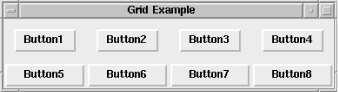
The -in option works the same way in grid as it does in pack. $widget will be placed in $otherwindow and not in the default parent of $widget.
Here is the usage:
-in => $otherwindow
As with any of the geometry managers, grid has a few methods associated with it. Each method is invoked via a widget that has been placed on the screen by using grid. Sometimes it is necessary to change the options of the group of cells that makes up your grid.
You can control resizing and the minimum size of a cell with the gridColumnconfigure and gridRowconfigure methods. Each takes a column or a row number as its first argument and then takes some optional arguments that will change the configuration of that column or row.
Both gridColumnconfigure and gridRowconfigure work similarly to the configure method used with widgets; however, the options you can specify with gridColumnconfigure and gridRowconfigure cannot be used with the grid command. The options you can use with gridColumnconfigure and gridRowconfigure are -weight, -minsize, and -pad.
If you send only a row or column number, a list of key/value pairs is returned with the current options and their values for that method:
@column_configs = $mw->gridColumnconfigure(0);
@row_configs = $mw->gridRowconfigure(0);
Depending on your sensibilities, you may want to store the results in a hash:
%column_configs = $mw->gridColumnconfigure(0);
%row_configs = $mw->gridRowconfigure(0);
In this example, we are getting the options and their values for the first column and the first row. The results of using the default values would look like this:
-minsize 0 -pad 0 -weight 0
-minsize 0 -pad 0 -weight 0
You can get the value of only one of the options by sending that option as the second argument:
print $mw->gridColumnconfigure(0, -weight), "\n";
print $mw->gridRowconfigure(0, -weight), "\n";
The results would be:
0
0
To change the value of the option, use the option followed immediately by the value you want associated with it. For example:
$mw->gridColumnconfigure(0, -weight => 1);
$mw->gridRowconfigure(0, -weight => 1);
You can also specify multiple options in one call:
$mw->gridColumnconfigure(0, -weight => 1, -pad => 10);
$mw->gridRowconfigure(0, -weight => 1, -pad => 10);
Now that we know how to call gridColumnconfigure and gridRowconfigure, we need to know what the three different options do.
The -weight option sets the amount of space allocated to the column or row when the window is divided into cells. Remember to use -sticky => "nsew" in your grid command if you want the widget to resize when the cell does. The default -weight is 0, which causes the column width or row height to be dictated by the largest widget in the column. Each -weight value has a relationship to the other -weight s in the rows or columns.
If a column or row has a -weight of 2, it is twice as big as a column or row that has a -weight of 1. Columns or rows of -weight 0 don't get resized at all. If you want all your widgets to resize in proportion to the size of the window, add this to your code before you call MainLoop:
($columns, $rows) = $mw->gridSize( );
for ($i = 0; $i < $columns; $i++) {
  $mw->gridColumnconfigure($i, -weight => 1);
}
for ($i = 0; $i < $rows; $i++) {
  $mw->gridRowconfigure($i, -weight => 1);
}
This code will assign the -weight of 1 to every single row and column in the grid, no matter what size the grid is. Of course, this example works only if you want to assign the same size to each row and each column, but you get the idea.
Here is an example of how the -weight option works (Figure 2-36 shows the result):
$mw->Button(-text => "Button1", -command => sub { exit })->grid
  ($mw->Button(-text => "Button2", -command => sub { exit }),
   $mw->Button(-text => "Button3", -command => sub { exit }),
   $mw->Button(-text => "Button4", -command => sub { exit }),
   -sticky => "nsew");

$mw->Button(-text => "Button5", -command => sub { exit })->grid
  ("x",
   $mw->Button(-text => "Button7", -command => sub { exit }),
   $mw->Button(-text => "Button8", -command => sub { exit }),
   -sticky => "nsew");

$mw->gridColumnconfigure(1, -weight => 1);
$mw->gridRowconfigure(1, -weight => 1);
By giving row 1 and column 1 weights of 1 (whereas all other rows and columns have 0 weights), they take over any extra available space when the size of the window is increased. Notice that columns 0, 2, and 3 are only as wide as is necessary to draw the Buttons and their text, but column 1 has filled in the extra space. The same effect happens for row 0 with a weight of 0 and row 1 with a new weight of 1. (The window has been resized larger to demonstrate the effects of -weight.)
The option -minsize sets the smallest width for the column or the smallest height for each row. The -minsize option takes a valid screen distance as a value. In this example, the minimum size of the cells in row 0 and column 0 is set to 10 pixels:
$mw->gridColumnconfigure(0, -minsize => 10);
$mw->gridRowconfigure(0, -minsize => 10);
If the column or row was normally less than 10 pixels wide, it would be forced to be at least that large.
You can add padding around the widget and to the widget by using the -padx/y and -ipadx/y options. You can also add a similar type of padding by using the -pad option with the gridColumnconfigure and gridRowconfigure methods. This padding is added around the widget, not to the widget itself. When you call gridColumnconfigure, the -pad option will add padding to the left and right of the widget. Calling gridRowconfigure with -pad will add padding to the top and bottom of the widget. Here are two examples:
$mw->gridColumnconfigure(0, -pad => 10);
$mw->gridRowconfigure(0, -pad => 10);
To find out how large a cell is, you can use the gridBbox method:
($xoffset, $yoffset, $width, $height) = $master->gridBbox(0, 2);
This example gets the bounding box for column 0 and row 2. All the values returned are in pixels. The bounding box will change as you resize the window. The four values returned represent the x offset, the y offset, the cell width, and the cell height (offsets are relative to the window or Frame where the widget is gridded). The bounding box dimensions include any and all padding specified by the -padx, -pady, -ipadx, and -ipady options.
Like packForget, gridForget removes widgets from view on the screen. This may or may not cause the window to resize itself; it depends on the size of $widget and where it was on the window. Here are some examples:
$mw->gridForget( );                # Nothing happens
$widget->gridForget( );            # $widget goes away
$widget->gridForget($widget1);    # $widget and $widget1 go away
$widget->gridForget($w1, $w3);    # $widget, $w1, $w3 go away
The widgets are undrawn from the screen, but the cells remain logically filled.
ThegridInfo method returns information about the $widget in a list format. Just as with packInfo, the first two elements indicate where the widget was placed:
@list = $widget->gridInfo( );  # Easier to print
%gridInfo = $widget->gridInfo( );
Here are some sample results from gridInfo:
-in Tk::Frame=HASH(0x81abc44) -column 0 -row 0 -columnspan 1 -rowspan 2 -ipadx 0
-ipady 0 -padx 0 -pady 0  -sticky nesw
The gridLocation method returns the column and row of the widget nearest the given (x, y) coordinates, relative to the master:
($column, $row) = $master->gridLocation($x, $y);
Both $x and $y are in screen units relative to the master window (in our examples, $mw). For locations above or to the left of the grid, -1 is returned.
When given the arguments (0, 0), our application returns this:
0 0
This indicates that the cell is at column 0 and row 0.
There is a gridPropagate method that is similar to packPropagate:
$master->gridPropagate( 0 );
When given a false value, gridPropagate turns off geometry propagation, meaning size information is not sent upward to the parent of $master. By default, propagation is turned on. If gridPropagate is not given an argument, the current value is returned.
To find out how large the grid has become after placing numerous widgets in it, you can use gridSize on the container widget to get back the number of columns and the number of rows:
($columns, $rows) = $master->gridSize( );
The list returned contains the number of columns followed by the number of rows. In many of the earlier examples, we had a grid size that was four columns by two rows.
($c, $r) = $f->gridSize( ); #$c = 4, $r = 2
It is not necessary for a widget to be placed in a column/row for it to be considered a valid column/row. If you place a widget in column 4 and row 5 by using -row=>5, -column=>4 and the only other widget is in row 0 and column 0, then gridSize will return 5 and 6.
There are two ways to find out which widgets have been put in a window or Frame: use gridSlaves without any arguments to get the full list, or specify a row and column. Here are examples of both:
@slaves = $mw->gridSlaves( );
print "@slaves\n";
The preceding code might have printed this:
Tk::Button=HASH(0x81b6fb8) Tk::Button=HASH(0x81ba454) Tk::Button=HASH(0x81ba4cc) Tk::
Button=HASH(0x81ba538) Tk::Button=HASH(0x81b6fa0) Tk::Button=HASH(0x81ba5e0) Tk::
Button=HASH(0x81ba6dc) Tk::Button=HASH(0x81ba748)
We could have specified the widget in column 0, row 0:
$widget = $mw->gridSlaves( -row => 0, -column => 0 );
print "$widget\n";
# Might print this: Tk::Button=HASH(0x81b6fb8)
If you specify only the -row option, you'll get a list containing only the widgets in that row. The same goes for specifying only -column; your list will contain only the widgets in that column.
|  | |
| 2. Geometry Management |  | 2.3. The place Geometry Manager |

Copyright © 2002 O'Reilly & Associates. All rights reserved.