 |  |

| |
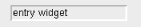
Until now, the only input we knew how to get from the user was a mouseclick on a Button widget (Button, Checkbutton, or Radiobutton), which is handled via the -command option. Getting input from a mouseclick is useful, but it's also limiting. The Entry widget (Figure 5-5) will let the user type in text that can then be used in any way by the application. Here are a few examples of where you might use an Entry widget:
In a database form that requires one entry per field (e.g., Name, Last name, Address)
In a software registration window that requires a serial number
In a login window that requires a username and password
In a configuration window to get the name of a printer
In an Open File window that requires the path and name of a file
Normally, we don't care what users type in an Entry widget until they are done typing, and any processing will happen "after the fact" when a user clicks some sort of Go Button. You could get fancy and process each character as it's typed by setting up a complicated bind, but it's probably more trouble than it's worth.
The user can type anything into an Entry widget. It is up to you to decide whether the text entered is valid or not. When preparing to use the information from an Entry, we should do some error checking. If we want an integer but get some alphabetic characters, we should issue a warning or error message to the user.
An Entry widget is much more complex than it first appears to be. The Entry widget is really a simplified one-line text editor. Text can be typed in, selected with the mouse, deleted, and added. An Entry widget is a middle-of-the-line widget; it's more complicated than a Button, but much less complicated than the Text or Canvas widget.
No surprises here:
$entry = $parent->Entry( [ option => value . . . ] )->pack;
When the Entry widget is created, it is initially empty of any text, and the insert cursor (if the Entry had the keyboard focus) is at the far-left side.
The following list contains a short description of each option available for configuring an Entry widget. Several of the options are discussed in more detail later in this chapter.
The following options behave as expected; we won't discuss them further: -background, -cursor, -font, -highlightbackground, -highlightcolor, -highlightthickness, -foreground, -justify, -takefocus, and -state. For more detailed information on these how these options affect a widget, see Chapter 3, "Fonts".
The -textvariable option lets you know what the user typed in the Entry widget:
-textvariable => \$variable
By now you should be familiar with this option from several of our Button examples. Any text input to the Entry widget will get assigned into $variable. The reverse also applies. Any string that gets assigned to $variable will show up in the Entry widget.
It is important to remember that no matter what the user enters, it will be assigned to this variable. This means that even if you are expecting numeric input (e.g., 314), you might get something like 3s14 if the user accidentally (or on purpose!) presses the wrong key(s). Before using any information from an Entry widget, it's a good idea to do some error checking to make sure it's the information you expect or, at the very least, in the correct format. Trying to use 3s14 in an equation would most likely produce undesired results.
The other way to find out what is in the Entry widget is to use the get method:
$stuff = $entry->get();
You can use get whether or not you have used the -textvariable option.
As with all the widgets, you can change the way the edges are drawn by using the -relief and/or -borderwidth options:
-relief => 'flat' | 'groove' | 'raised' | 'ridge' | 'sunken'
-borderwidth => amount
The default relief for an Entry is 'sunken', which is a change from what we've seen so far. Figure 5-6 shows the different relief types at different -borderwidth values, incrementing from the default (2) to 4 and to 10.
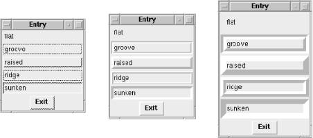
This is the code snippet that created the five Entry widgets and used the relief name as the Entry widget's text:
foreach (qw/flat groove raised ridge sunken/) {
  $e = $mw->Entry(-relief => $_)->pack(-expand => 1);
  $e->insert('end', $_);  # put some text in the Entry
}To manipulate the text in the Entry widget, you need some way to identify specific portions or positions within the text. The last example actually used an index in it. The line $e->insert('end', $_) uses the index 'end'. Just like the insert method (covered later in the chapter), all of the methods that require information about a position will ask for an index (or two, if the method requires a range of characters). This index can be as simple as 0, meaning the very beginning of the text, or something more complicated, such as 'insert'.
Here are the different forms of index specification and what they mean:
If our selected text was the word nose in this string (shown here in bold):
My mother hit your mother right on the nose
'sel.first' would indicate the n.
You can select the text in an Entry widget and make several things happen. The indexes 'sel.first' and 'sel.last' point to the beginning and end of the selected text, respectively. You can also make the selected text available on the clipboard on a Unix system by using the -exportselection option:
-exportselection => 0 | 1
The -exportselection option indicates whether or not any selected text in the Entry will be put in the selection buffer in addition to being stored internal to the Entry as a selection. By leaving this option's default value, you can paste selected text into other applications.
The selected text also has some color options associated with it: -selectbackground,-selectforeground, and -selectborderwidth:
-selectbackground => color
-selectforeground => color
-selectborderwidth => amount
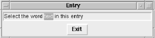
The -selectbackground and -selectforeground options change the color of the text and the area behind the text when that text is highlighted. In Figure 5-7, the word "text" is selected.
You can change the width of the edge of that selection box by using -selectborderwidth. If you left the size of the Entry widget unchanged, you wouldn't see the effects of it. The Entry widget cuts off the selection box. To actually see the results of increasing the -selectborderwidth value, use the -selectborderwidth option in the Entry command and -ipadx and -ipady in the geometry management command. Figure 5-8 illustrates -selectborderwidth.
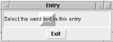
You might want to change the -selectborderwidth option if you like a little extra space around your text or if you really want to emphasize the selected text. Here's the code that generated the Entry widget in Figure 5-8:
$e = $mw->Entry(-selectborderwidth => 10)->pack(-expand => 1,
                                                -fill => 'x',
                                                -ipadx => 10,
                                                -ipady => 10);
$e->insert('end', "Select the word text in this Entry");
Notice the -ipadx and -ipady options in the pack command.
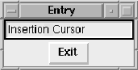
The insert cursor is that funny-looking little bar that blinks on and off inside the Entry widget when it has the keyboard focus. It will only show up when the Entry widget actually has the keyboard focus. If another widget (or none) has the keyboard focus, the insertion cursor remains but is invisible. In Figure 5-9, the insertion cursor is immediately after the second "n" in the word "Insertion."

You can change the thickness, border width, and width of the insertion cursor by using these options:
-insertbackground => color
-insertborderwidth => amount
-insertwidth => amount
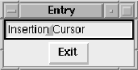
The -insertwidth option changes the width of the cursor so it looks fatter. The -insertbackground option changes the overall color of the insertion cursor. Figure 5-10 shows an example.
No matter how wide the cursor, it is always centered over the position between two characters. The insertion cursor in Figure 5-10 is in the same location it was in Figure 5-9. This can look distracting to users and might just confuse them unnecessarily, so you most likely won't change the -insertwidth option.
You can give the insertion cursor a 3D look by using -insertborderwidth (as in Figure 5-11). Like the -insertwidth option, the -insertborderwidth option doesn't have much practical use.
You can change the amount of time the cursor blinks on and off by using these options:
-insertofftime => time
-insertontime => time
The default value for -insertofftime is 300 milliseconds. The default for -insertontime is 600 milliseconds. The default values make the cursor's blink stay on twice as long as it is off. Any value specified for these options must be nonnegative.
For a really frantic-looking cursor, change both values to something much smaller. For a relaxed and mellow cursor, double the default times. If you don't like a blinking cursor, change -insertofftime to 0.
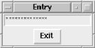
There are times when you'll request information from the user that shouldn't be displayed on the screen. To display something other than the actual text typed in, use the -show option:
-show => char
The char is a single character that will be displayed instead of the typed-in characters. For a password Entry, you might use asterisks (see Figure 5-12). If you specify a string, just the first character of that string will be used. By default, this value is undefined, and whatever the user actually typed will show.
When using the -show option, the information stored in the associated $variable will contain the real information, not the asterisks.
If you use this feature, the user can't cut and paste the password (regardless of the value of -exportselection). If it is cut and pasted to another screen, what the user saw on the screen (e.g., the asterisks) is actually pasted, not the information behind it. You might think that if you did a configure on the Entry widget, such as $entry->configure(-show => "");,the words the user entered would suddenly appear. Luckily, this isn't true. A bunch of \x0 s (essentially gibberish) show up instead. Any variable that uses the -textvariable option and is associated with the Entry will still contain the correct information. If you perform an $entry->get( ), the correct (nongibberish) information will be returned. The get method is described later in this chapter.
You can perform input validation as characters are typed in an Entry widget, although, by default, validation is disabled. You enable validation using the -validate option, specifiying what events trigger your validation subroutine. The possible values for this option are focus and focusin (when the Entry gets the keyboard focus), focusout (when the Entry loses focus), key (on any key press), or all.
The -validatecommand callback should return true to accept the input or false to reject it. When false is returned, the -invalidcommand callback is executed.
The -validatecommand and -invalidcommand callbacks are called with these arguments:
The proposed value of the Entry (the value of the text variable too)
The characters to be added or deleted; undef if called due to focus, explicit call, or change in text variable
The current value before the proposed change
The index of the string to be added/deleted, if any; otherwise, -1
The type of action: 1 for insert, 0 for delete, -1 if a forced validation or text variable validation
This Entry ensures that characters are restricted to those in the string "perl/Tk", without regard to case:
my $e = $mw->Entry(
    -validate        => 'key',
    -validatecommand => sub {$_[1] =~ /[perl\/Tk]/i},
    -invalidcommand  => sub {$mw->bell},
)->pack;If the information requested from the user could get lengthy, the user can use the arrow keys to manually scroll through the text. To make it easier, we can create and assign a horizontal Scrollbar to the Entry widget by using the -xscrollcommand option:
-xscrollcommand => [ 'set' => $scrollbar ]
For now, we're going to show you the most basic way to assign a Scrollbar to the Entry widget. For more details on the Scrollbar, see Chapter 6, "The Scrollbar Widget".
The following code creates a Scrollbar and associates it with an Entry widget:
$scroll = $mw->Scrollbar(-orient => "horizontal"); # create Scrollbar
$e = $mw->Entry(-xscrollcommand => [ 'set' => $scroll ])->
pack(-expand => 1, -fill => 'x'); # create Entry
$scroll->pack(-expand => 1, -fill => 'x');
$scroll->configure(-command => [ $e => 'xview' ]); # link them
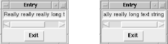
$e->insert('end', "Really really really long text string");Figure 5-13 shows the resulting window in two states: on the left, the window as it looked when it was created, and on the right, how it looks after scrolling all the way to the right.
You'll rarely want to use a Scrollbar with an Entry widget. The Scrollbar doubles the amount of space taken, and you can get the same functionality without it by simply using the arrow keys when the Entry widget has the focus. If the user needs to enter multiple lines of text, you should use a Text widget instead. See Chapter 8, "The Text, TextUndo,and ROText Widgets" for more information on what a Text widget can do.
Both cget and configure are the same for the Entry widget as they are for any of the other widgets. The default options for the Entry widget are listed in Chapter 13, "Miscellaneous Perl/Tk Methods".
You can use the delete method when you want to remove some or all of the text from the Entry widget. You can specify a range of indexes to remove two or more characters or a single index to remove one character:
$entry->delete(firstindex, [ lastindex ])
To remove all the text, you can use $entry->delete(0, 'end'). If you use the -textvariable option, you can also delete the contents by reassigning the variable to an empty string: $variable = "".
Here are some other examples of how to use the delete method:
$entry->delete(0);        # Remove only the first character
$entry->delete(1);        # Remove the second character

$entry->delete('sel.first', 'sel.last')  # Remove selected text
if $entry->selectionPresent(); # if presentThere are two ways to determine the content of the Entry widget: the get method or the variable associated with the -textvariable option. Using the get method, $entry_text = $entry->get() will assign the entire content of the Entry widget into $entry_text.
How you access the content depends on what you are going to do with the information. If you only need to reference it once in order to write it to a file or insert it into a database, it doesn't make sense to waste memory by storing it in a variable. Simply use the get method in the print statement (or wherever it would be appropriate). If the information in the Entry widget is going to be a frequently used value, such as a number for a mathematical calculation, then it makes sense to initially store it in a variable for easy access later.
The icursor method will place the cursor at the specified index:
$entry->icursor(index);
By default, the insertion cursor starts out wherever the last insert took place. To force the insertion cursor to show up elsewhere, you could do something like this:
$e_txt = "Entry Text";
$e = $mw->Entry(-textvariable => \$e_txt)->pack( );
$e->focus;
$e->icursor(1); # put cursor at this index
We use the focus method (which is not specific to the Entry widget; it's generic to all widgets) to have the application start with the focus on our Entry widget. Then we place the insertion cursor between the first and second characters (indexes 0 and 1) in the Entry. See Chapter 13, "Miscellaneous Perl/Tk Methods" for more information on focus.
You might want to move the starting position of your cursor if you are starting the text with a specific string. For instance, set $e_txt = "http://" and then $e->icursor('end').
The index method will convert a named index into a numeric one:
$numindex = $entry->index(index) ;
One of the uses of index is to find out how many characters are in the Entry widget: $length = $entry->index('end'). Of course, if we used the -textvariable option, we could get the same result by using $length = length($variable).
As an example of using index to find where the current selection starts, use this code:
$startindex = $entry->selectionPresent() ?
                $entry->index('sel.first') : -1;
We discuss selectionPresent later in the chapter.
The insert function will let you insert any text string at the specified index:
$entry->insert(index, string);
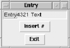
Here's a simple application that uses insert:
#!/usr/bin/perl
use Tk;
$mw = MainWindow->new;
$mw->title("Entry");

$e_txt = "Entry Text";    # Create Entry with initial text
$e = $mw->Entry(-textvariable => \$e_txt)->pack(-expand => 1,
                                                -fill => 'x');
$mw->Button(-text => "Exit",
            -command => sub { exit })->pack(-side => 'bottom');

# Create a Button that will insert a counter at the cursor
$i = 1;
$mw->Button(-text => "Insert #", -command =>
            sub {
              if ($e->selectionPresent( )) {
                $e->insert('sel.last', "$i"); $i++;
              }
            })->pack;
MainLoop;
We fill the Entry widget with "Entry Text" as a default. Then we create two Buttons. The first one is the obvious Exit Button that will allow us to quit the application. The second one is a bit more complicated. When pressed, it will check to see if any text is selected in the Entry $e. If text is selected, it will insert a number that keeps track of how many times we have pressed the Insert # Button.
In Figure 5-14, we first selected the word "Entry" and then pressed the Insert # Button four times. Each time it was pressed, it inserted a number at the index "sel.last". This index didn't change in between button presses, so it looks as if we are counting backward!
Both scanMark and scanDragto allow fast scrolling within the Entry widget. A call to scanMark simply records the x coordinate passed in for use later with scanDragto. It returns an empty string.
$entry->scanMark(x);
$entry->scanDragto(x);
The companion function to scanMark is scanDragto, which also takes an x coordinate. The new coordinate is compared to the scanMark x coordinate. The view within the Entry widget is adjusted by 10 times the difference between the coordinates.
And don't forget you can always drag the contents of the Entry widget left and right by holding down mouse button 2.
The selection method has several possible argument lists. If you look at the web page documentation, you'll see that you can use:
$entry->selectionAdjust(index).
You might also see the form $entry->selection('adjust', index), where 'adjust' is the first argument. Be aware that they mean the same thing as you read code written by other people.
You can adjust the selection to a specified index by using selectionAdjust:
$entry->selectionAdjust(index);
The selected text is extended toward the index (from whichever end is closest).
$entry->selectionClear( );
Any selection indicator is removed from the Entry widget, and the indexes 'sel.first' and 'sel.last' are now undefined. The selected text remains.
To reset the 'anchor' index to the specified index, use selectionFrom:
$entry->selectionFrom(index);
This does not affect any currently selected text or the indexes 'sel.first' and 'sel.last'.
The only way to check if there is a selection in the Entry widget is to use selectionPresent:
if ($entry->selectionPresent( )) {
}
It returns a 1 if there is a selection, which means you can safely use the 'sel.first' and 'sel.last' indexes (if there isn't a selection, an error will be printed when you refer to either index). selectionPresent will return a 0 if there is no current selection.
You can change the selection range by calling selectionRange:
$entry->selectionRange(startindex, endindex);
The two indexes indicate where you would like the selection to cover. If startindex is the same or greater than endindex, the selection is cleared, causing 'sel.first' and 'sel.last' to be undefined. Otherwise, 'sel.first' and 'sel.last' are defined the same as startindex and endindex, respectively.
The selectionTo method causes the new selection to be set from the current 'anchor' point to the specified index:
$entry->selectionTo(index);
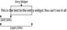
xview is a method that will change its purpose based on what arguments are passed in. With no arguments, it will return a two-element list containing numbers from 0 to 1. These two numbers define what is currently visible in the Entry widget. The first number indicates how much of the text is off to the left and not visible. If it is .3, then 30% of the text is to the left of the Entry widget. The second number returned is how much of the text is not visible on the left side of the Entry widget plus the amount that is visible in the widget. In this case, 50% of the text is actually visible in the Entry widget (see Figure 5-15).
($left, $right) = $entry->xview( );
When passing an index value to xview, the text in the Entry widget will shift position so that the text at the specified index is visible at the far-left edge:
$entry->xview(index);
The rest of the forms of xview have to do directly with scrolling (and are explained in detail in Chapter 6, "The Scrollbar Widget"):
$entry->xviewMoveto(fraction);
$entry->xviewScroll(number, what);
|  | |
| 5. Label and Entry Widgets |  | 5.3. The Perl/Tk LabEntry Mega-Widget |

Copyright © 2002 O'Reilly & Associates. All rights reserved.