 |  |

| |
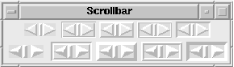
Instead of automatically creating one or more Scrollbars with the Scrolled method, you can use the Scrollbar widget method and perform the configuration yourself. It is better to create and configure your own Scrollbars when you need to do something nonstandard, such as have one Scrollbar scroll two Listboxes. Figure 6-6 shows a Scrollbar widget.
To create the Scrollbar, invoke the Scrollbar method from the parent widget. It returns a reference to the newly created Scrollbar that you can use for configuration:
$scrollbar = $mw->Scrollbar([ options ...])
There are at least two other things you need to do to get a Scrollbar working with another widget. First, create the to-be-scrolled widget and use the Scrollbar with its -xscrollcommand or -yscrollcommand option. Then configure the Scrollbar so that it knows to talk to that widget. Here's an example that creates a Listbox widget (don't worry if you don't quite follow all of this now; we just want to show a complete example before we go on to talk about all the options):
# Create the vertical Scrollbar
$scrollbar = $mw->Scrollbar( );
$lb = $mw->Listbox(-yscrollcommand => ['set' => $scrollbar]);
#Configure the Scrollbar to talk to the Listbox widget
$scrollbar->configure(-command => ['yview' => $lb]);

#Pack the Scrollbar first so that it doesn't disappear when we resize
$scrollbar->pack(-side => 'right', -fill => 'y');
$lb->pack(-side => 'left', -fill => 'both');
Creating the Scrollbar is pretty simple; we want all the default options for it. As we create the Listbox, we have to set up a callback so the Listbox can communicate with the Scrollbar when the contents of the Listbox move around. Our Scrollbar is vertical, so the -yscrollcommand option has the set command and our Scrollbar assigned to it (if it is horizontal, use -xscrollcommand). When the contents of the Listbox are scrolled by the user without using the Scrollbar, the Listbox will alert the Scrollbar by invoking $scrollbar->set(...).
The line $scrollbar->configure(-command => ['yview' => $lb]) does almost the opposite: it configures the Scrollbar to communicate with the Listbox. When the user clicks the Scrollbar, it will invoke $lb->yview(...) to tell the Listbox how to change the view of the contents. Use the y version of the view command, as it's a vertical Scrollbar.
There is more information on the details of yview in Section 6.3.8, "How the Scrollbar Communicates with Other Widgets", later in this chapter. The last two lines in this example pack the Scrollbar and the Listbox in the window so the Scrollbar is the same height and lies to the right of the Listbox.
Always pack your Scrollbars first within the window or Frame. This allows the Scrollbars to remain visible when the user resizes the window smaller. It will then resize the Listbox (or other widget) but leave the Scrollbars visible on the edges of the screen.
Now that we've seen a complete example of how to create a Scrollbar and how to set up the widget it will scroll, we can go over the options with an idea of how they are used.
This list contains the options available with a Scrollbar and their quick definitions. The important options are discussed in more detail later in this chapter.
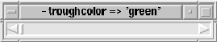
Within the Scrollbar, we have a new part of the widget called a trough. This trough gets its own coloring through the -troughcolor option. The trough is considered the part behind the arrows and slider. Figure 6-7 shows an example.
The background of the Scrollbar consists of the arrows, the slider, and a small portion around the outside of the trough. You change the color of the background by using the -background option. The -activebackground option controls the color displayed when the mouse cursor is over one of the arrows or the slider. Figure 6-8 shows two examples of -background; the second window uses both -background and -troughcolor.
The -relief and -borderwidth options affect both the outside edges of the Scrollbar and the arrow1, arrow2, and slider elements. This is similar to how the Checkbutton and Radiobutton widgets are affected by the -relief and -borderwidth options. See Figure 6-9 for a screenshot of different values for these two options, in the order 'flat', 'groove', 'raised', 'sunken', and 'solid'.
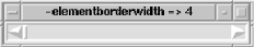
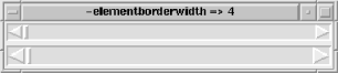
The -activerelief option affects the decoration of three elements—arrow1, arrow2, and slider—when the mouse cursor is over them. The -elementborderwidth affects the same three elements: arrow1, arrow2, and slider. The width of these elements' edges can be changed with this option. The -borderwidth option also changes the width of these elements but changes the width of the edges of the widget as well. Notice in Figure 6-10 how the edges of the Scrollbar remain at a width of 2.
The -width of the Scrollbar is the distance across the skinny part of the Scrollbar, not including the borders. Figure 6-11 demonstrates how the Scrollbar changes when you alter the -width.
As mentioned earlier, a Scrollbar can be vertical or horizontal. The default for a Scrollbar is 'vertical'. To change this, use the -orient option:
$scrollbar = $mw->Scrollbar(-orient => 'horizontal');
You could also use -orient => 'vertical', but it's the default, so it's not necessary.
When you click on one of the arrows in a Scrollbar, you cause the slider to move in that direction by one unit. If you continue to hold down the mouse button, after a bit of a delay, the slider will auto-repeat that movement. The -repeatdelay option determines the amount of time you must wait before the auto-repeat kicks in. The default is 300 milliseconds.
Once you have held the mouse button down long enough to start auto-repeating, there is a short delay between each time it repeats the action. This delay is controlled by the -repeatinterval option. The default for -repeatinterval is 100 milliseconds.
Normally, when you click on the slider and move it around, the data within the widget will move accordingly. This is because the Scrollbar is updating the widget continuously as you move the slider. To change the Scrollbar so it will only update the widget when you let go of the slider, use the -jump option and set it to 1. The default for -jump is 0. You would most likely want to use -jump => 1 when your scrolled widget contains a large amount of data and waiting for the screen to update while you slide through it would make the application seem slow.
When you create a Scrollbar, you tell it which widget to talk to and which method in that widget to call by using the -command option with an anonymous list. The list contains the name of the method to call and the widget from which that method should be invoked. In this code snippet, we can see that we want to use the yview command to scroll the widget $lb (a Listbox):
$scrollbar->configure(-command => ['yview' => $lb])
Now when the user clicks on the Scrollbar, it will invoke $lb->yview. We know that the Scrollbar associated with $lb is vertical because it uses the yview command. For a horizontal Scrollbar, use xview. Both yview and xview tell the widget to move the widget contents an amount that is determined by where the user clicked in the Scrollbar. The yview and xview methods are covered in the next section.
As described earlier, you use the -command option with the Scrollbar so it knows which widget and method to use when the Scrollbar is clicked. The command should be xview for horizontal Scrollbars and yview for vertical Scrollbars. You can call these methods yourself, but most of the time you won't want to.
Both xview and yview take the same type of arguments. Where the user clicks in the Scrollbar determines the value used, but the value will always be sent as one of the following forms:
$widget->xviewMoveto(0);
If the slider is moved to the center of the Scrollbar, the argument is 0.5:
$widget->xviewMoveto(0.5);
The first argument is the numberof units to scroll by. The value for number can be any number, but it's typically either 1 or -1. A value of 1 means the next unit of data on the bottom or right of the widget becomes visible (scrolling one unit of data off the left or top). A value of -1 means that a previous unit of data will become visible in the top or right of the widget (one unit will scroll off the bottom or right of the widget). For example, every time the user clicks on the down arrow in a vertical Scrollbar associated with a Listbox, a new line shows up at the bottom of the Listbox.
The second argument is the string "units". What a unit is depends on the widget. In a Listbox, a unit would be one line of text. In an Entry widget, it would be one character.
Here are some example calls:
	# User clicked down arrow
	$listbox->yviewScroll(1, "units");

	# User clicked up arrow
	$listbox->yviewScroll(-1, "units");

	# User clicked right arrow
	$entry->xviewScroll(1, "units");
The type of page is defined by the widget being scrolled. For example, a Listbox would page up or down by the number of lines shown in the Listbox. It would page right or left by the width of the Listbox.
You can get and set any of the options available with a Scrollbar by using cget and configure. See Chapter 13, "Miscellaneous Perl/Tk Methods" for complete details on these methods.
The set method, which we tell the scrolled widget about when we create it, defines what is visible. In our first example, we created a Listbox and told it to use our Scrollbar and the set method:
$scrollbar = $mw->Scrollbar( );   # Vertical Scrollbar
$lb = $mw->Listbox(-yscrollcommand => ['set' => $scrollbar ]);
When the widget invokes the set command, it sends two fractions (first and last) as the arguments:
$scrollbar->set(first, last);
This will change the position in the data we are seeing. The arguments first and last are real numbers between 0 and 1. They represent the position of the first data item we can see and the position of the last data item we can see, respectively. If we can see all the data in our widget, they would be and 1. The first value gets larger as more data is scrolled off the top, and the last value gets smaller as more data is scrolled off the bottom. You will probably never find a case in which to call set yourself, so just try to get an idea of what it does behind the scenes.
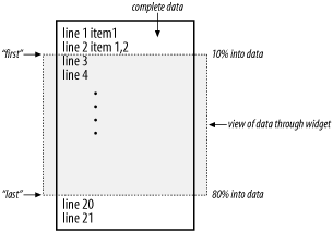
Figure 6-12 shows a hypothetical document that we are viewing with a vertically scrolled widget. The dashed rectangle represents the view of what we can currently see within the widget. When the widget calls set, it determines how far into the document the first viewable item is and sends this as the first argument. In Figure 6-12, this would be 10%, or 0.10. The second argument to set is how far into the document the last viewable item is. In our example, this would be 90%, or 0.90.
The get method returns in a list whatever the latest arguments to set were:
($first, $last) = $scrollbar->get( );
This data can change if the widget requests a change in position of the data or if the Scrollbar requests a change.
To determine which part of the Scrollbar is active, you can use the activate method:
$elem = $scrollbar->activate( );
The value returned is an empty string (which means no element is currently active) or the name of the currently active element. The possible elements are "arrow1", "arrow2", or "slider".
If you send an element name as the argument to activate, that element will change to the color and relief specified by the -activebackground and -activerelief options. The element will continue to display that color and relief until an event (such as the mouse cursor passing over the element) causes it to change. Contrary to what you might believe, using activate does not invoke that element. Here are some examples:
$scrollbar->activate("arrow1");
$scrollbar->activate("arrow2");
$scrollbar->activate("slider");
There is no activate for "trough", because the trough doesn't change color when the mouse is over it.
The number returned by delta indicates how much the Scrollbar must change to move the slider deltax pixels for horizontal Scrollbars and deltay pixels for vertical Scrollbars. (The inapplicable argument is ignored for each type of Scrollbar.)
$amount = $scrollbar->delta(deltax, deltay)
The amount returned can be positive or negative.
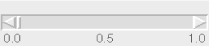
Given a point at (x, y), fraction will return a real number between 0 and 1 indicating where that coordinate point would fall in the trough of the Scrollbar:
$loc = $scrollbar->fraction(x, y);
The point (x, y) must be relative to the Scrollbar. Figure 6-13 shows the location of three possible results from fraction: 0.0, 0.5, and 1.0.
The identify method returns a string containing the name of the element located at the (x, y) coordinate:
$elem = $scrollbar->identify(x,y);
If (x, y) is not in any element, the string will be empty. Both x and y must be pixel coordinates relative to the Scrollbar. The possible element names are "arrow1", "arrow2", "trough", and "slider".
|  | |
| 6.2. The Scrolled Method |  | 6.4. Examples |

Copyright © 2002 O'Reilly & Associates. All rights reserved.