 |  |

| |
Options used with the Text method change the way the text is displayed within the Text widget. The following options are standard for all the widgets (see Chapter 4, " Button, Checkbutton, and Radiobutton Widgets", where the options were first covered, for further information):
You can use the -font option to change the font, including how large or small the text is (see Figure 8-1). This defines the default font for the entire Text widget. Text that is inserted without a text tag (which allows you to specify formatting that applies only to certain portions of the text) will use this font.
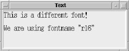
The use of fonts was covered in Chapter 3, "Fonts", where we first discussed the -font option.
When you first create a Text widget, it will usually have a height of 24 lines and a width of 80 characters. Depending on how you put the Text widget in its parent window (whether you use pack with the -expand and -fill options or grid with -sticky => "nsew"), it can change size when the window changes size. To force the Text widget to a certain size, you can use the -width and -height options:
# Text widget 20 characters wide and 10 lines tall
$mw->Text(-width => 20, -height => 10)->pack;
While both options take numbers, they have different units associated with them. The value associated with -width is in characters[17] and the value associated with -height is lines of text. It's possible that the Text widget will not be that exact width and height if you force the main window to be larger via the minsize routine (i.e., $mw->minsize(400,400)), especially if you used -expand => 1 and -fill => 'both' with the pack command. So if you don't see what you expect on the screen the first time out, keep this in mind.
[17]For a proportional font, the width is based on the width of the character "0".
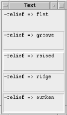
As with other widgets, you can change how the edges of the Text widget are drawn using the -relief and -borderwidth options. The examples shown in Figure 8-2 might not look much like Text widgets, but trust me, they are (they would look much more like Text widgets if there were scrollbars associated with each widget, but we were trying to save space in the screenshot)! Figure 8-2 also shows -width and -height options to force smaller size.
Long lines of text can wrap around automatically if the line becomes longer than the width the Text widget can display. The amount of room left between different types of lines is defined by using the -spacingN options. Figure 8-3 shows the different areas that -spacing1, -spacing2, and -spacing3 affect.
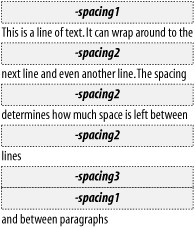
The -spacing1 option affects how much room is above a new line of text (the first line in a paragraph). The -spacing2 option affects the space between lines when text that is wrapped automatically is too long to fit on one line. The -spacing3 option determines how much room is left after a paragraph is finished (right after an explicit newline).
The default setup for Text widget tab stops is every eight characters. Each tab equals eight spaces (but it doesn't actually use spaces). You can replace this default setting by using the -tabs option as follows:
-tabs => [qw/2 center/]   # Place tabs every 2 pixels
-tabs => [2, "center"]    # The same thing, different syntax
The argument that goes with -tabs is an anonymous list that specifies positions in which to place each of the tab stops. You can also specify an optional justification value for each tab stop (as in the preceding example) after each tab stop's numerical value. This all sounds much more confusing than it really is. Here are some examples to help clarify things:
-tabs => [qw/1i center/]   # every inch, text centered on tab-stop
-tabs => [qw/1i 1.5i/]     # ts at 1 inch, 1.5 inch and every .5 inch after
The default justification is "left". The possible justification values are "left", "right", "center", and "numeric".
When you specify the values (whether in centimeters, inches, or pixels), they are not cumulative. The list ["1i", "1.5i"] translates to one tab stop 1 inch from the left edge of the Text widget and the next tab stop 1.5 inches from the left edge. If the specified list isn't long enough to span the entire window, the distance between the last two tab stops specified will be repeated across the screen.
Of course, setting up new tab stops is pretty useless unless you're doing major text editing; in most cases, you'll leave this option alone.
You can reset the tab stops back to the default by setting -tabs to undef:
$text->configure(-tabs => undef);
|  | |
| 8. The Text, TextUndo, and ROText Widgets |  | 8.3. A Short Break for a Simple Example |

Copyright © 2002 O'Reilly & Associates. All rights reserved.