 | Cascading Style Sheets: The Definitive Guide |  |

Font Families
Font Weights
Font Size
Styles and Variants
Using Shorthand: The font Property
Font Matching
Summary
As the authors of the specification clearly recognized, font selection will be a popular feature of CSS. After all, how many pages are littered with dozens, or even hundreds, of <FONT face="..."> tags? In fact, the beginning of the "Font Properties" section of CSS1 begins with the sentence, "Setting font properties will be among the most common uses of style sheets."
The truth is that, for now, there isn't a way to ensure consistent font use on the Web, because there isn't a uniform way of describing fonts and variants of fonts. For example, the fonts Times, Times New Roman, and TimesNR may be similar or the same, but how would a user agent know that? An author might specify TimesNR in a document, but what happens when a user without that particular font installed views the document? Even if Times New Roman is installed, the user agent cannot know that the two are effectively interchangeable. And if you're hoping to force a certain font on a reader, forget it. Although CSS2 has facilities for downloadable fonts, these are not well implemented, and a reader could always refuse to download fonts for performance reasons. CSS does not provide ultimate control over fonts, any more than does a word processor: when a Microsoft Office document you have created is loaded on someone else's machine, its display will depend on that person's installed fonts. If they don't have the same fonts you do, then the document will look different. The same is true of documents designed using CSS.
The font naming problem extends much further than trying to match font names and becomes especially confusing in the realm of font variants, such as bold or italic text. Most people know what italic text looks like, but how is it different from slanted text? Yes, there are differences, but most people would be hard put to describe them. These are not the only terms used to refer to such text, of course; there are also the terms oblique, incline (or inclined ), cursive, and kursiv, among others. Thus, one font may have a variant called something like Times Italic, whereas another uses something like Garamond Oblique. Although the two may be effectively equivalent as the "italic form" of each font, they are labeled quite differently. Similarly, the font variant terms Bold, Black, and Heavy may or may not mean the same thing.
CSS1 attempts to provide some resolution mechanisms for all these questions, although it cannot provide a complete solution. The most complicated parts of font handling in CSS1 are font family matching and font weight matching, with font size calculations running a close third. The font aspects addressed by CSS1 are font styles, such as italic, and font variants such as small caps; these are much more straightforward, relatively speaking. These features are all brought together in a single property, font, which we'll discuss at the end of this section. First, let's discuss font families, since they're the most basic step in choosing the right font for your document.
Although there are, as was discussed earlier, a number of ways to label what is effectively the same font, CSS1 makes a valiant attempt to help user agents sort out the mess. After all, what we think of as a "font" may be composed of a large number of variations to describe boldfacing, italic text, and so forth. As an example, you're probably familiar with the font Times. However, Times is actually a combination of many variants, including TimesRegular, TimesBold, TimesItalic, TimesOblique, TimesBoldItalic, TimesBoldOblique, and so on. Each of these variants of Times is an actual font face, but Times, as we usually think of it, is a combination of all these variant faces. In other words, Times is actually a font family, not just a single font, even though most of us think about fonts as being single entities.
In addition to each specific font family such as Times, Verdana, Helvetica, or Arial, CSS defines five generic font families:
Fonts that are proportional and have serifs. A font is proportional if all characters in the font have a different widths due to their various sizes. Thus, a lowercase i and a lowercase m are of different widths. (This book's default font is proportional, for example.) Serifs are the decorations on the ends of strokes within each character, such as little lines at the top and bottom of a lowercase l or at the bottom of each leg of an uppercase A. Examples of serif fonts are Times, Garamond, and New Century Schoolbook.
Fonts that are proportional but do not have serifs. Examples of sans serif fonts are Helvetica, Geneva, Verdana, Arial, and Univers.
Fonts that are not proportional. These generally are used to emulate typewritten text or the output from an old dot-matrix printer or an even older video display terminal. In these fonts, each character is exactly the same width as all the others, so that a lowercase i is the same width as a lowercase m. These fonts may or may not have serifs. If a font has uniform character widths, it is classified as monospace, regardless of the presence of serifs. Examples of monospace fonts are Courier and Andale Mono.
Fonts that attempt to emulate human handwriting. Usually, these fonts are composed largely of curves and have stroke decorations that exceed those found in serif fonts. For example, an uppercase A might have a small curl at the bottom of its left leg. Examples of cursive fonts are Zapf Chancery, Author, and Comic Sans.
Fonts that are not really defined by any single characteristic other than their inability to be easily classified in one of the other families. A few such fonts are Western and Klingon.
In theory, every font family a user could install will fall into one of these generic families. In practice, this may not be the case, but the exceptions (if any) are likely to be few and far between.
Any of these families can be employed in a document by using the property font-family.
font-family
- Values
[[<family-name> | <generic-family>],]* [<family-name> | <generic-family>]
- Initial value
UA specific
- Inherited
yes
- Applies to
all elements
If you wish for a document to use a sans serif font, but you do not particularly care which, then the appropriate declaration would be this:
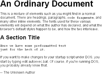
BODY {font-family: sans-serif;}This will cause the user agent to pick a sans serif font family such as Helvetica and apply it to the BODY element. Thanks to inheritance, this will apply that font choice to the entire document (unless a more specific selector overrides it, of course). The result is something like what's shown in Figure 5-1.
Using nothing more than these generic families, an author can create a fairly sophisticated style sheet. Take the following rule set, which is illustrated in Figure 5-2:
BODY {font-family: serif;}
H1, H2, H3, H4 {font-family: sans-serif;}
CODE, PRE, TT, SPAN.input {font-family: monospace;}
P.signature {font-family: cursive;}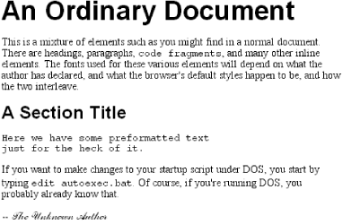
Thus, most of the document will be in a serif font such as Times, including all paragraphs save those that have a class of signature, which will instead be rendered in a cursive font such as Author. Headings 1 through 4 will be in a sans serif font like Helvetica, while the elements CODE, PRE, TT, and SPAN.input will be in a monospace font like Courier -- which, as it happens, is how the first three of those elements are usually presented.
An author may, on the other hand, have more specific preferences about which font is used in the display of an element. In a similar vein, a user may want to create a user style sheet that defines the exact fonts used in the display of all documents. In either case, font-family is still the property to use.
Assume for the moment that all H1s should use Garamond as their font. The simplest rule for this would be the following:
H1 {font-family: Garamond;}This will cause a user agent displaying the document to use Garamond for all H1s, as shown in Figure 5-3.
Assuming, that is, the user agent has Garamond available for use. What if, for whatever reason, it doesn't? In that case, the user agent will be unable to use the rule at all. It won't ignore the rule, but if it can't find a font called "Garamond," then it won't be able to do anything with the rule.
All is not lost, however. By combining specific font names with generic font families, documents will come out at least close to the author's intentions. To continue the previous example, the following markup tells a user agent to use Garamond, if it's available, but if not, then to use another serif font:
H1 {font-family: Garamond, serif;}If a reader doesn't have Garamond installed but does have Times, the user agent might use Times for H1 elements, as Figure 5-4 depicts. Even though this isn't an exact match, it's probably close enough.
For this reason, authors are very strongly encouraged to always provide a generic family as part of any font-family rule. By doing so, you let user agents that can't provide an exact font match use their fallback mechanisms to pick an alternative.
This is especially helpful since, in a cross-platform environment, there is no way to know who has which fonts installed. Sure, every Windows machine in the world may have Arial and Times New Roman installed, but many Macintoshes do not, and the same is probably true of Unix machines. Conversely, while Chicago and Charcoal are common to all recent Macintoshes, it's unlikely that Windows and Unix users will have either font installed, and even less likely that they'll have both. Therefore, declarations involving these fonts, and any others, should always end with a generic font family:
H1 {font-family: Arial, sans-serif;}
H2 {font-family: Charcoal, sans-serif;}
P {font-family: TimesNR, serif;}
ADDRESS {font-family: Chicago, sans-serif;}
Again, this isn't required, but it is a very good idea.
If you're familiar with fonts, you might have a number of similar fonts in mind for use in displaying a given element. Let's say that you want all paragraphs in a document to be displayed using Times, but you would also accept TimesNR, Garamond, New Century Schoolbook, and New York (all of which are serif fonts). First, decide the order of preference for these fonts, and then string them together with commas like this:
P {font-family: Times, TimesNR, 'New Century Schoolbook', Garamond,
      'New York', serif;}
Based on this list, a user agent will look for the fonts in the order they're listed. If none of the listed fonts are available, then it will simply pick a serif font that is available.
You may have noticed the presence of single quotation marks in the previous example, which we haven't seen before. Quotation marks are needed in a font-family declaration only if a font name has one or more spaces in it, such as "New York," or if the font name includes symbols such as # or $. In both cases, the entire font name needs to be enclosed in quotation marks to keep the user agent from getting confused about what the name really is. (You might think the commas would suffice for this, but no.) Thus, a font called Karrank% would need to be quoted:
H2 {Wedgie, 'Karrank%', Klingon, fantasy;}If you leave off the quotation marks, the odds are high that user agents will ignore that particular font name altogether, although they'll still process the rest of the rule. Font names that use a single word, like Garamond, need not be quoted, and generic family names ("serif," "monospace," and the like) should never be quoted. If you quote a generic name, then the user agent will assume you are asking for a specific font with that name (for example, "serif "), not a generic family.
As for which quotation marks to use, both single and double quotation marks are acceptable. However, if you place a font-family rule in a STYLE attribute, you'll need to use whichever quotes you didn't use for the attribute itself. Thus, if you use double quotation marks to enclose the font-family rule, then within the rule you'll have to use single quotes. If you used double quotes in such a circumstance, they would interfere with the attribute syntax, as you can see from Figure 5-5:
P {font-family: sans-serif;}  /* sets paragraphs to sans-serif by default */

<!-- the next example is correct (uses single-quotes) -->
<P STYLE="font-family: 'New Century Schoolbook', Times, serif;">...</P>

<!-- the next example is NOT correct (uses double-quotes) -->
<P STYLE="font-family: "New Century Schoolbook", Times, serif;">...</P>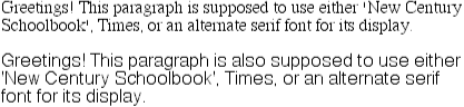
Returning to the subject of providing alternate fonts: generally, such lists are comprised of fonts from the same generic family, but this need not be the case. Instead of listing all serif fonts or all sans serif fonts or all cursive fonts, you can mix them up as much as you like. The only restriction is that you can provide only a single generic family at the end of the font-family declaration:
P.signature {Author99, ScriptTM, serif;}Here, the author has said that if neither Author99 nor ScriptTM are available for use, then the user agent should use any serif font. Why not specify cursive for the generic font family? Let's extend the example a little further:
P {font-family: Verdana, sans-serif;}
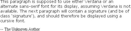
P.signature {font-family: Author99, ScriptTM, cursive;}Assume that these styles are applied to a document and that the document is viewed by someone who has neither of the two listed "signature" fonts available and who further has no cursive fonts available. In such a circumstance, the entire rule must be ignored by the user agent, and the element <P CLASS="signature"> will be displayed in Verdana, or another sans serif font if Verdana is not available, as shown in Figure 5-6.
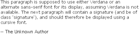
This happens because the element is a paragraph, and since its rule cannot be used, the more generic rule P {font-family: Verdana, sans-serif;} applies. In order to avoid this, a better set of rules would be as follows:
P {font-family: Verdana, sans-serif;}
P.signature {font-family: Author99, ScriptTM, serif;}
This way, the "signature" paragraph is more likely to be in a font different than the rest of the document, as shown in Figure 5-7.
All of this fun font-matching stuff crops up again in another realm: selecting the weight of a given font.
|  | |
| 4.2. Summary |  | 5.2. Font Weights |

Copyright © 2002 O'Reilly & Associates. All rights reserved.